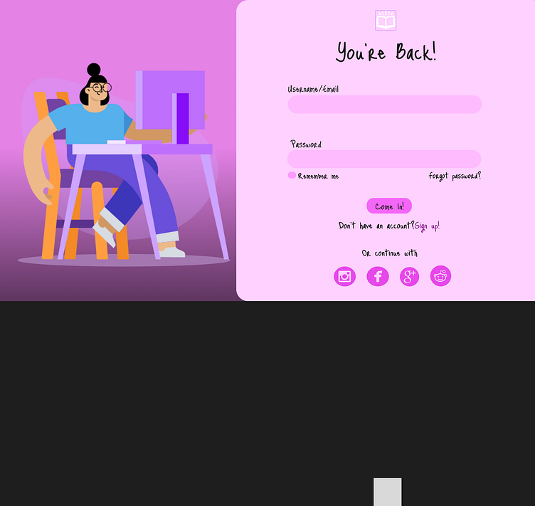
Daily Challenge#1-Login Page
As someone with zero background to design, I participated in a 30-day UI design challenge with the aim of learning about the basics of UI design.
My first task was to design a simple login page for my fictional rant website called Writer's Crisis, which is open to all writers who have encountered a block in their creativity journey.
The choice of color was to reflect a sense of warmth to the users when they log in to the website, which will bring about a sense of resonance in being part of a community that is free to share their frustrations, thoughts or insights to writer's block.
More by Abah Mary View profile
Like
