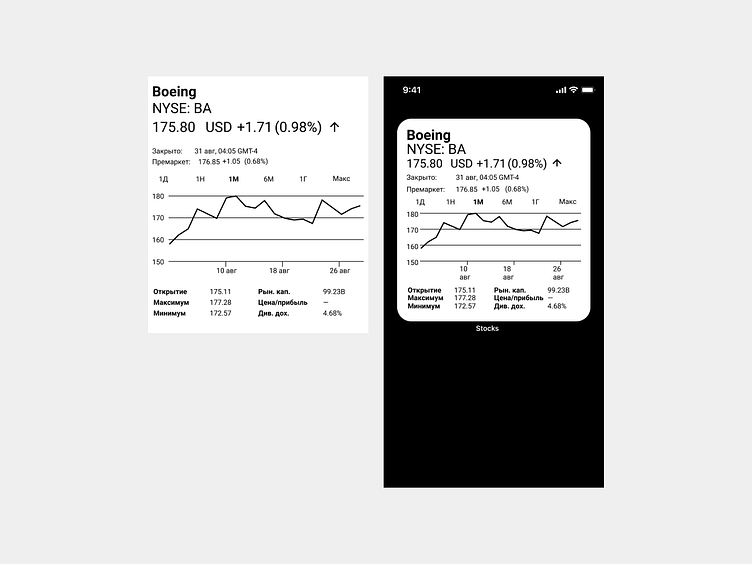
Stock app widget
The story behind this shot
This shot is a result of participating in «Detepr workout» season 2. The task was to create (optionally) a widget or a screen of a separate application based on the data from the example. I was interested in making a widget.
Thoughts behind this shot
I started the design process by researching interesting references for the widget user interface. To grasp the specific aspects of how widgets function, I was inspired by various elegant user interfaces and consulted Apple's Human Interface Guidelines, with a focus on the section about widgets.
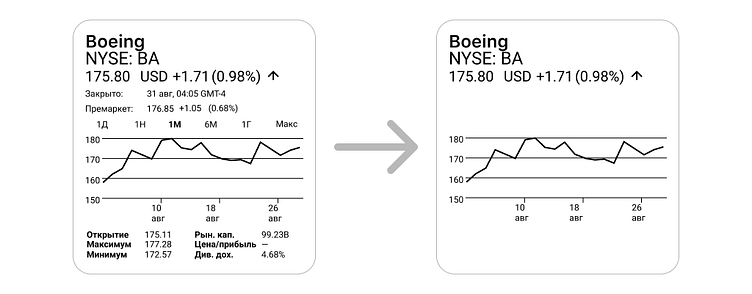
Next, I began the process of designing the widget, and it was essential to decide what information to include for the widget’s content. The initial data provided for the task were suitable for a full-featured application but proved to be excessive for a widget. Thus, I eliminated information that appeared to be non-essential for the anticipated user scenarios.
According to the iOS guidelines, widgets are intended to present information and deliver specific functions without necessitating the user to log into the app. Consequently, a widget should not act as an exhaustive analytics tool, as accessing such detailed functionality would require users to open the application itself.
Considering this, the widget cannot fulfil the role of an analytics tool as it requires more complex functionality provided by the full app. Therefore, the widget would be most effective in a scenario such as «asset monitoring», where users can get a quick overview without needing to engage with the app in depth.
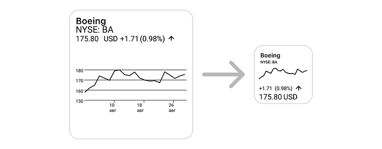
So I removed almost all the information necessary for analysis, leaving only the key indicators and a graph to understand the trading trend. The widget seemed big for so much information, so I organized the remaining data into a smaller format.

After that, I thought, what if there is a scenario where a user is browsing stocks and still needs a little more detailed information and minimal functionality to understand the trend? So I decided to create a second widget that would be larger (the original size), with a more detailed graph and the ability to view different data by time period.
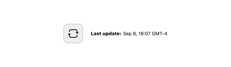
From the guidelines, I noted an interesting limitation regarding widgets: they do not update continuously in real-time. However, for a stocks widget, it's crucial for users to know how current their data is.
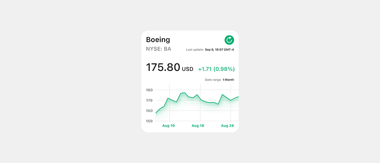
Consequently, I incorporated the last data update timestamp and an 'update' button into the design to ensure users are aware of the data's relevancy. So the very first version of the widget design looked like this 👆👆.
After working on the color, margin, and typographic design of the widget, I began to wonder why I might need a larger version. If it were larger, it could be more important to users and might have more functionality and data. In order to differentiate between the two types of widgets, I decided to add a "time period" feature for the larger widget and display data by default for the shorter time period on the smaller widget.
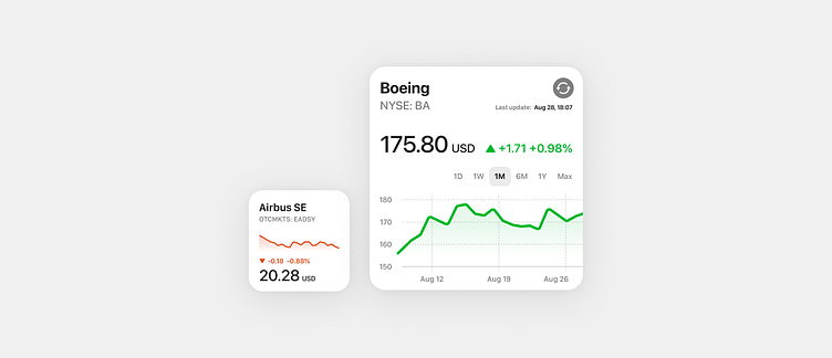
After working on the color, margin, and typographic design of the widget, I began to wonder why I might need a larger version. If it were larger, it could be more important to users and might have more functionality and data. In order to differentiate between the two types of widgets, I decided to add a "time period" feature for the larger widget and display data by default for the shorter time period on the smaller widget.
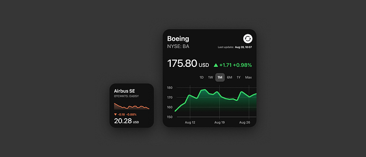
Subsequently, I decided to create a dark UI color scheme, as the user may use a dark system theme or find it more familiar for this type of digital solution. It's worth noting that the shades of gray, as well as the red and green hues, vary between the widgets designed for different themes.
