Hopper Branding

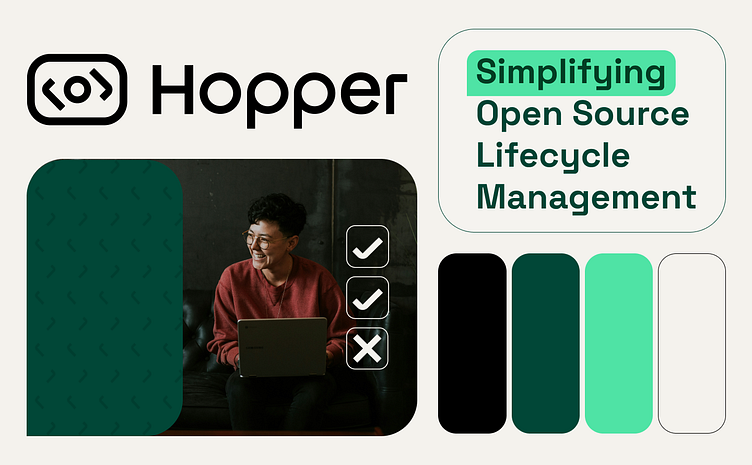
A complete brand identity I crafted for Hopper. Hopper is an open-source management platform that examines various risks linked to open-source software, providing unparalleled visibility and delivering precise, actionable insights.
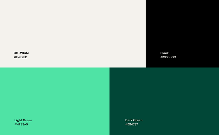
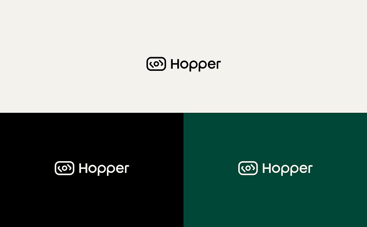
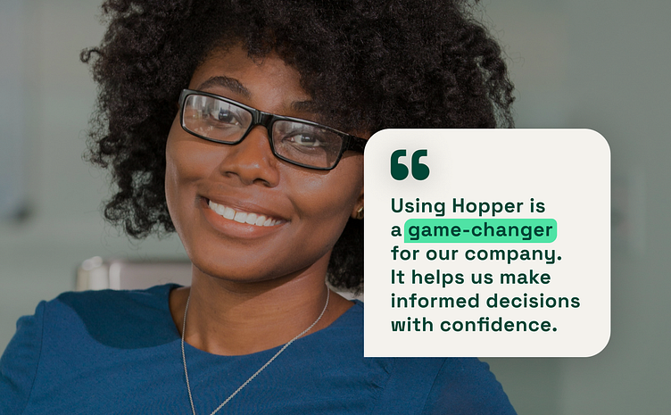
Hopper stands out for its precise, user-friendly products that offer quick deployment and cutting-edge technology. With a laser focus on open-source solutions, they embody values of holistic, effective, and clarity. Other brand values include simplicity, precision, innovation, organization, speed, and flexibility, all reflected in the logo and graphic language design, which exude cleanliness, sophistication, and innovation.
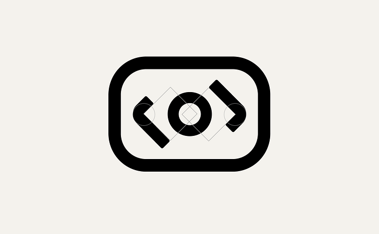
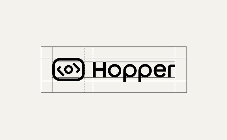
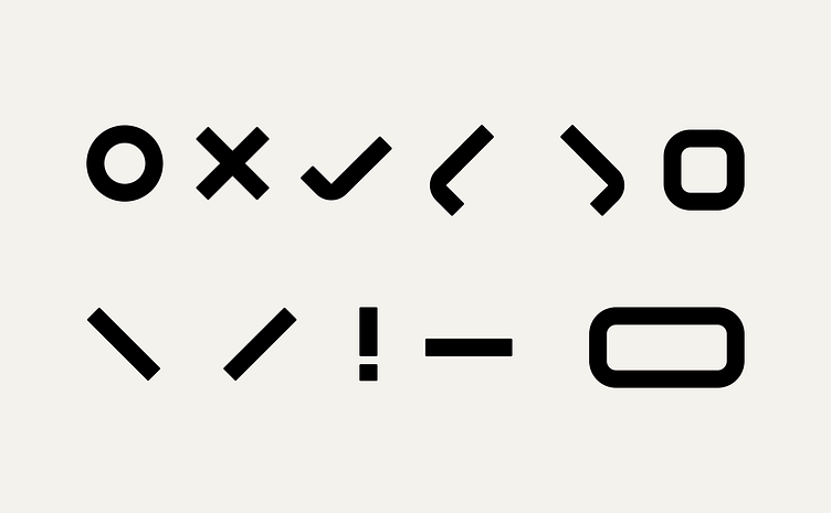
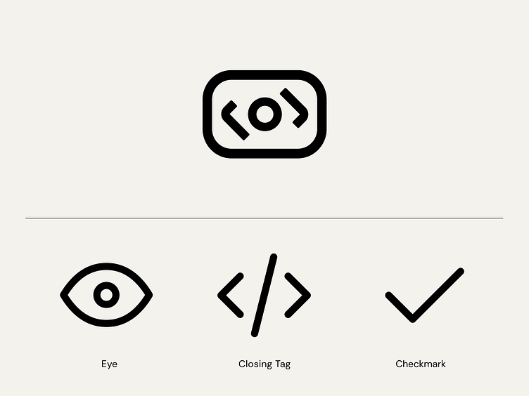
The logo symbol draws inspiration from the shape of an eye, symbolizing intelligence in risk detection, accuracy, power, and a holistic approach to risk management. The eye shape was combined with the closing tag </> and a checkmark. 👁
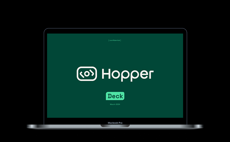
February - March 2024
About the Brand Process
Initiating the branding journey alongside entrepreneurs involved in exploring the brand's essence. We defined the brand's golden circle model (why, how, what), core values, target audience, and competitors, along with establishing the brand persona and tone of voice. Drawing inspiration from the eye's imagery and shape, I developed a concept and progressed with logo sketches and graphic language. Weekly meetings with the CEO ensured alignment throughout the branding process until the final brand presentation. Following the presentation, I formulated brand guidelines covering the logo, color palette, typography, shapes, images, and usage instructions to ensure brand consistency. Additionally, I extended the branding to various products like presentation templates, email signatures, and social media assets.