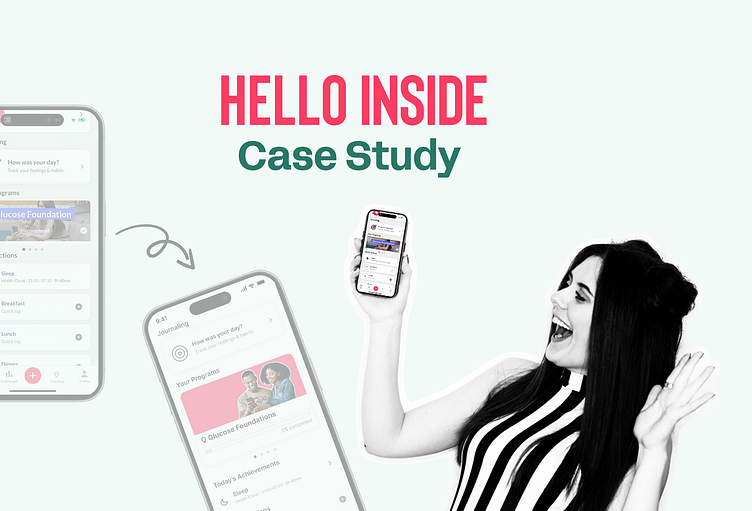
Hello Inside Case Study
HI 👋 This is a deficit-oriented view, aiming to identify areas for improvement and explore ways to enhance various aspects of user interfaces. While startups, like the one we are examining, often deliver strong products, there is always room for evolution in every development cycle.
I hope this analysis enlightens your next app review and inspires approaches for enhancement.
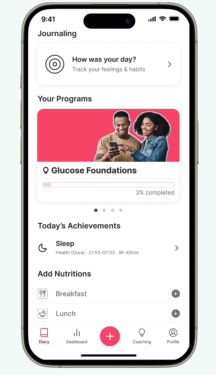
Firstly, Hello Inside is a mobile app designed to visualize blood sugar tracking, contextualize it, and offer tips for a healthier lifestyle. Importantly, its target audience is not diabetics; it positions itself as a lifestyle product focused on female bodies.
I've pinpointed three areas worth examining: banner blindness, overall makeover, and content design.
Banner Blindness
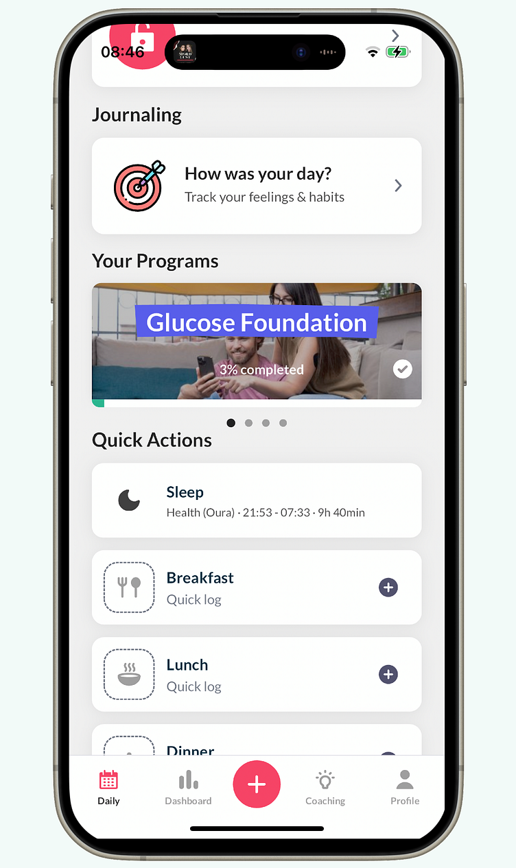
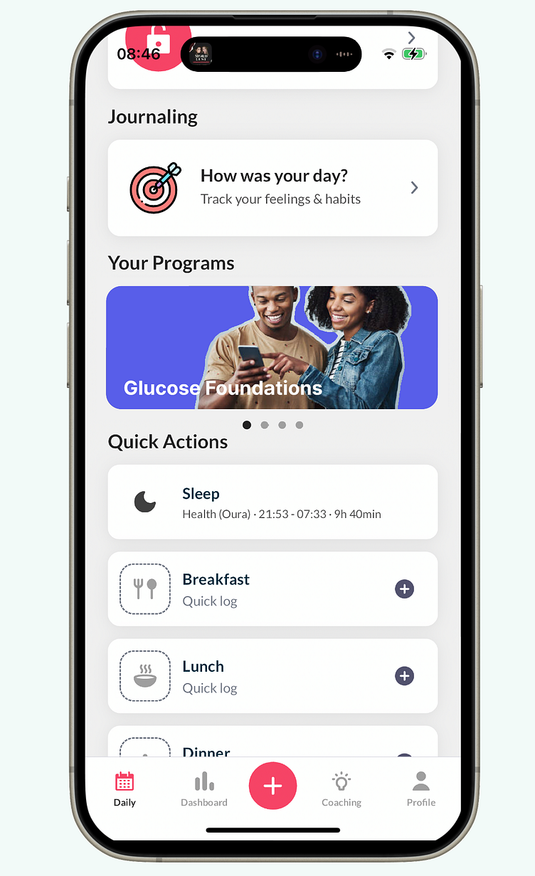
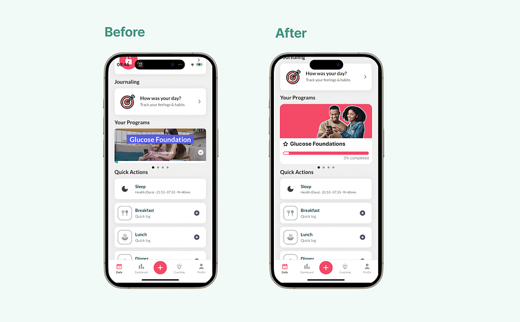
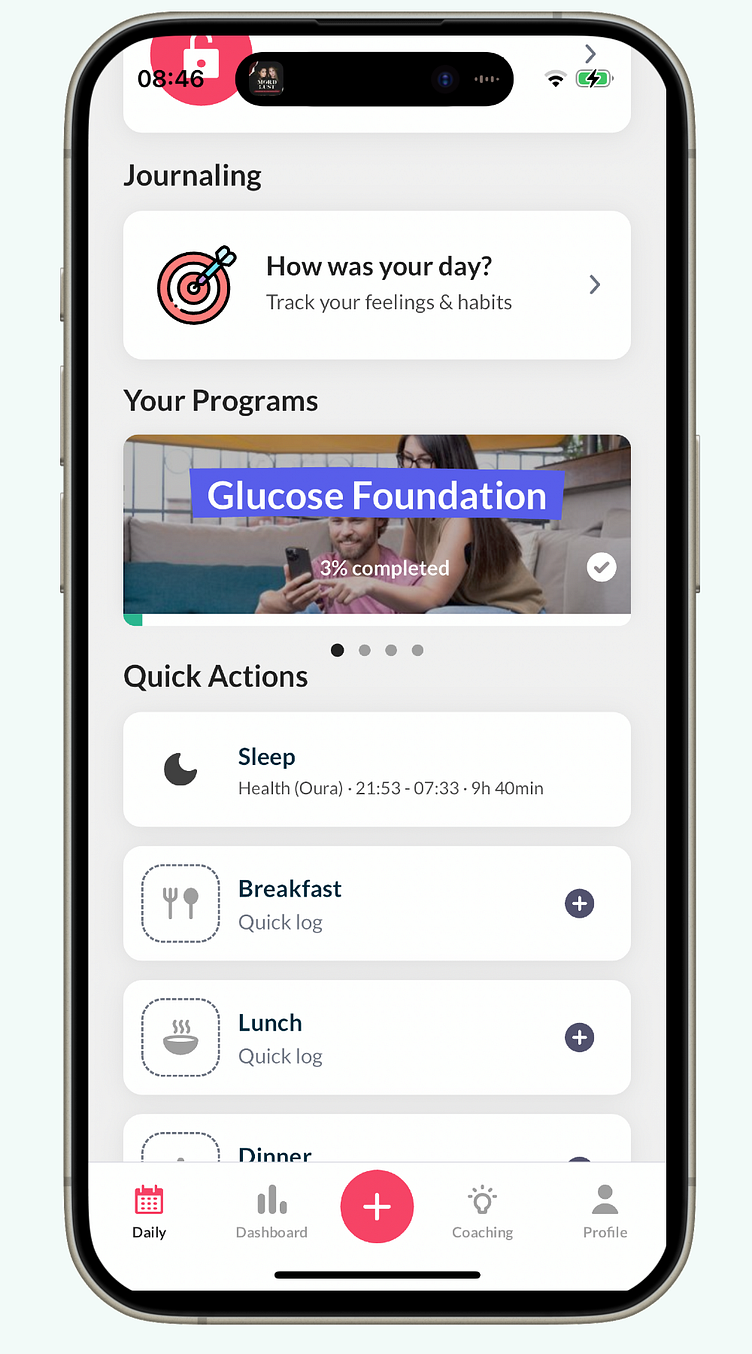
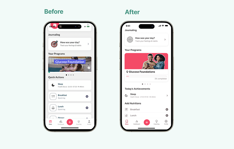
Upon reviewing the app, the first issue that struck me was its susceptibility to banner blindness. An extra learning section is highlighted (e.g., in the navigation bar), yet I found myself scrolling past without paying attention, its imagery too reminiscent of advertising. I even missed the progress bar, which could have signaled ongoing engagement.
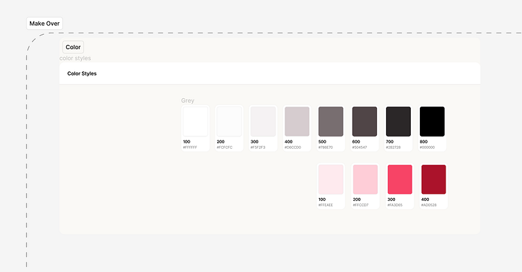
To counteract this, I first searched for similar imagery, then leveraged their brand and primary colors to create multiple redesigns for this section.
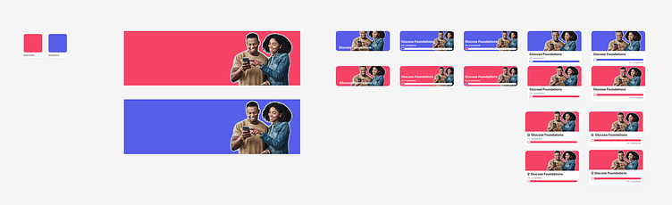
I included the brand color because they are using it in the original design to highlight the heading. However, it seemed illogical to use the brand color arbitrarily, so I focused on experimenting with their primary pink. Incorporating more of this color into the banner helped integrate it more seamlessly with the app, distancing it from the feel of mere advertising. I opted for a design that included a progress bar, aligning with their initial concept.
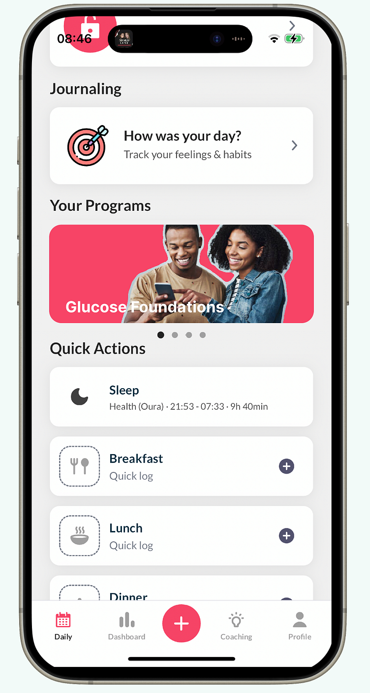
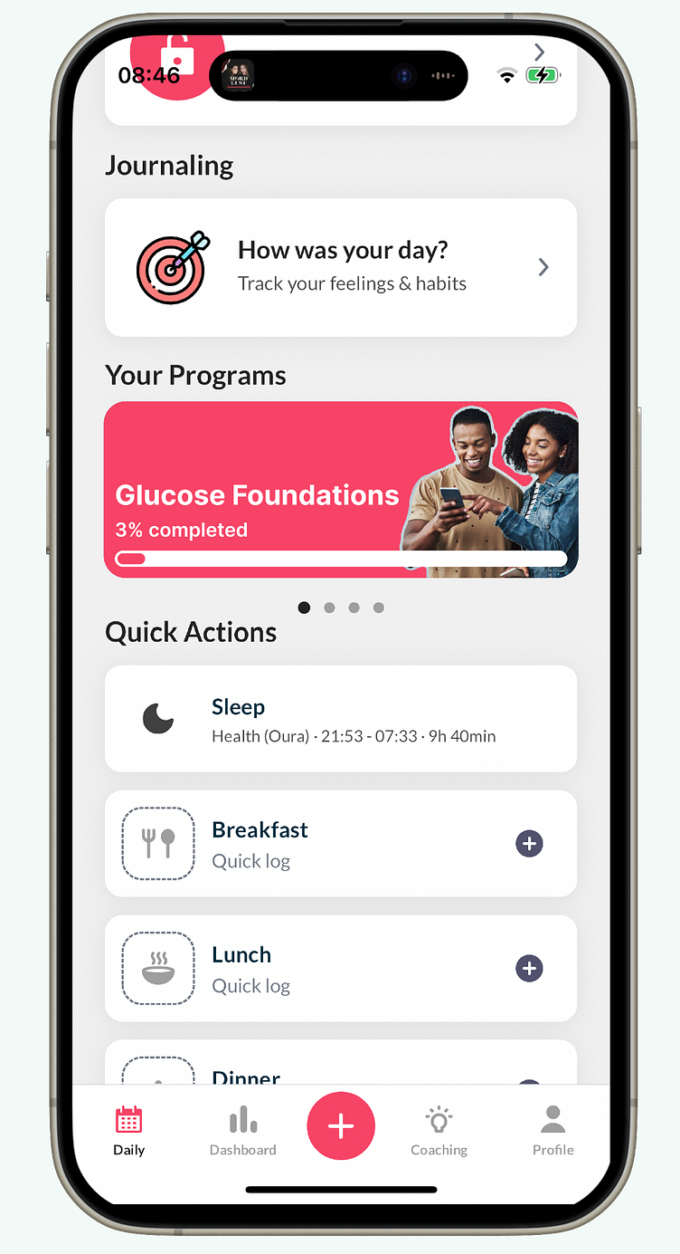
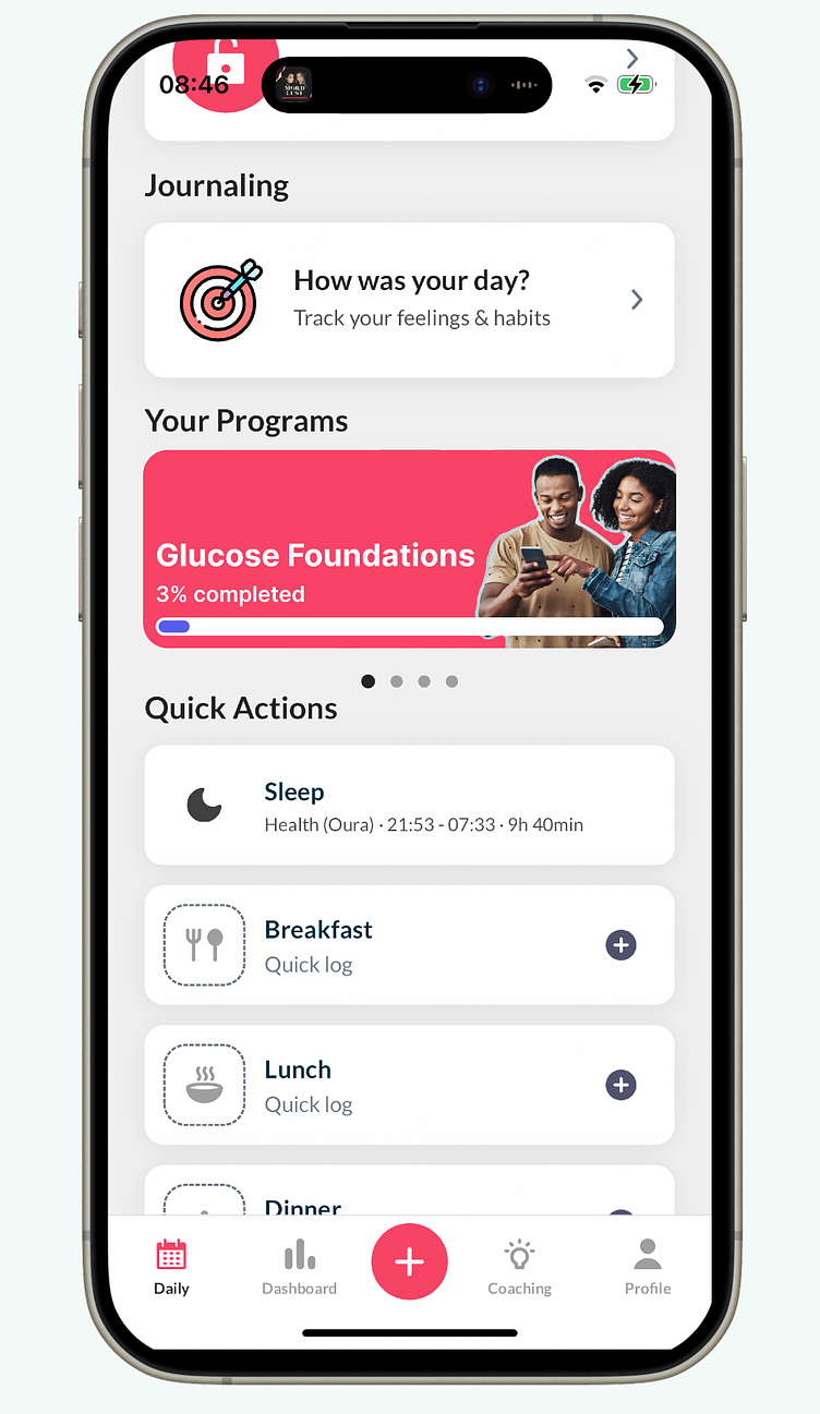
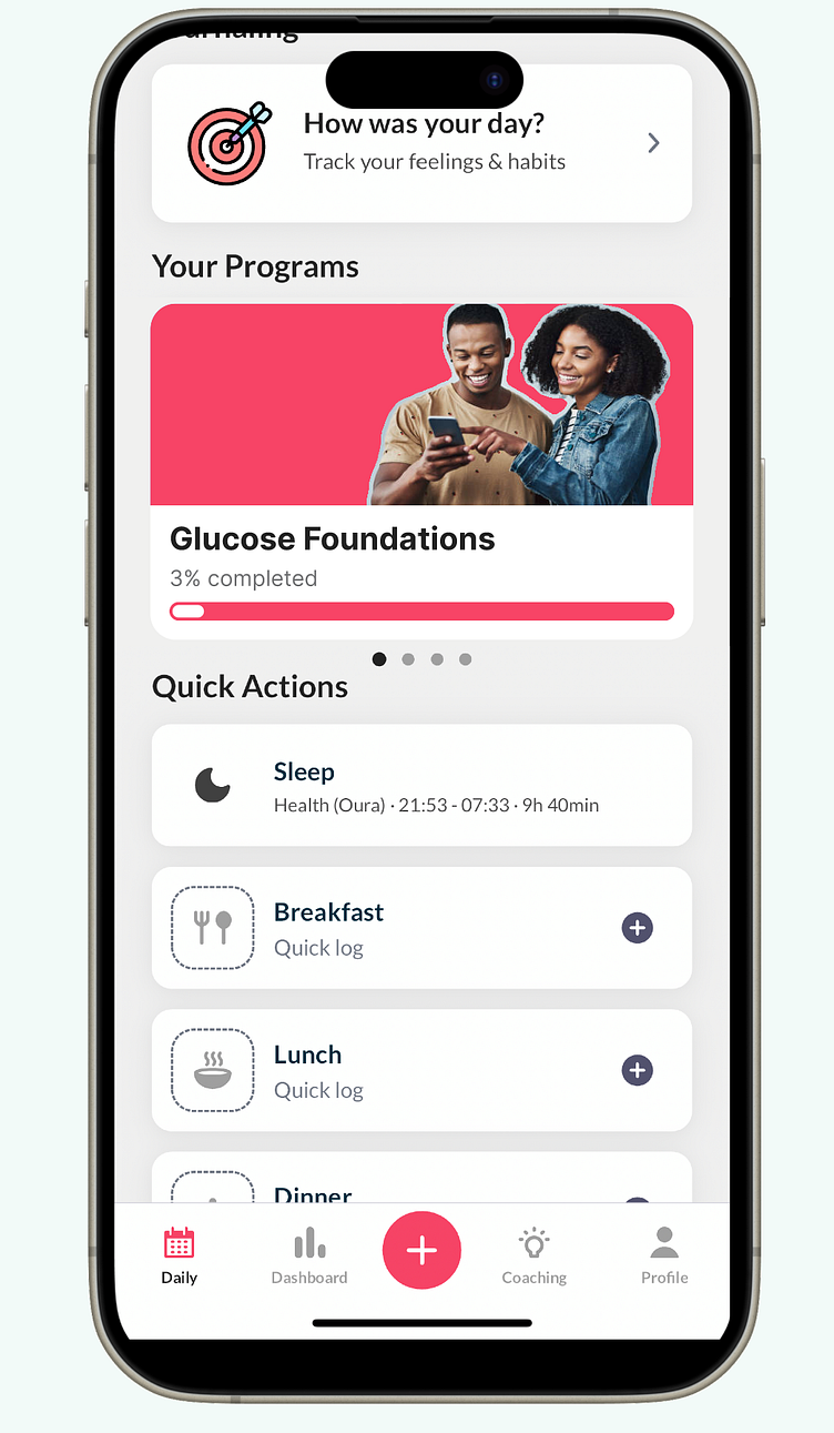
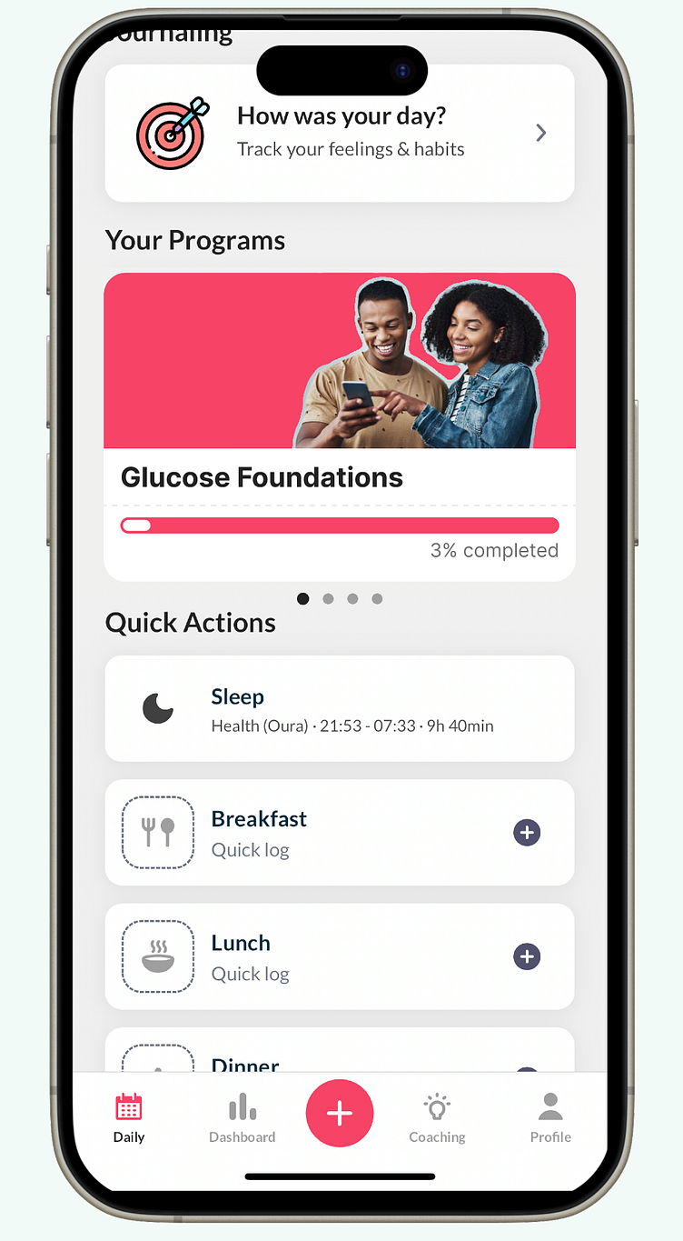
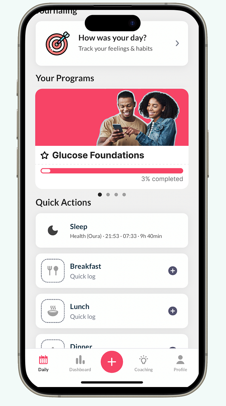
This adjustment aims to mitigate banner blindness effectively.
Makeover
Reconstructing the UI in Figma, I understood the confusion stemming from their landing page design; almost every feature shared a similar card design. By introducing new sections and list designs, I achieved a clearer hierarchy and enhanced usability through greater visual contrast between features.
Moreover, I refined the color palette. While retaining their primary pink, I developed a grayscale based on this hue, ensuring a coherent appearance. I removed the grey background, which seemed mismatched, and introduced a primary color scale to establish a color hierarchy. For instance, the active "daily" tab does not need to share the same primary color as the central plus button, preventing users from being overwhelmed by suggesting that everything on the screen shares equal importance.
I also renamed "Daily" to "Diary" for better clarity and overhauled the icons, especially in the navigation bar, for consistency. Previously, the app had a perplexing mix of both outlined and filled icons. I opted for a set of outlined icons to achieve a more cohesive look, eliminating the arbitrary distinction.
These decisions also consider the aesthetics of "big players" in the market, like Airbnb, Wolt, etc. Aligning the app's design more closely with these established entities may boost user confidence through familiarity and trust.
Content Design
This aspect poses a challenge, particularly for startups. The lifestyle-blood sugar sector often employs potent language concerning nutrition, which, while potentially marketing-driven, demands careful consideration of ethical product design and psychology. I advise against language that might trigger negative emotions, risking user retention.
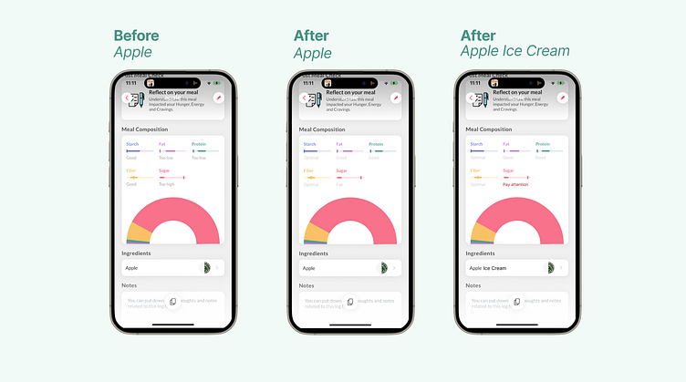
For instance, the app's feedback on consuming an apple, critiquing certain ingredients as "too low" or "too high," could benefit from a contextual overhaul.
A preferable approach might involve gradations like:
Optimal
Good
Fair
Pay attention
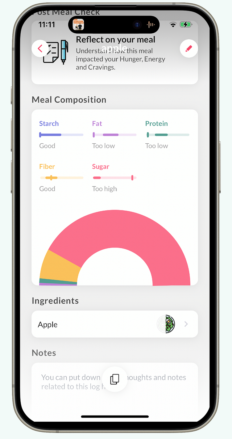

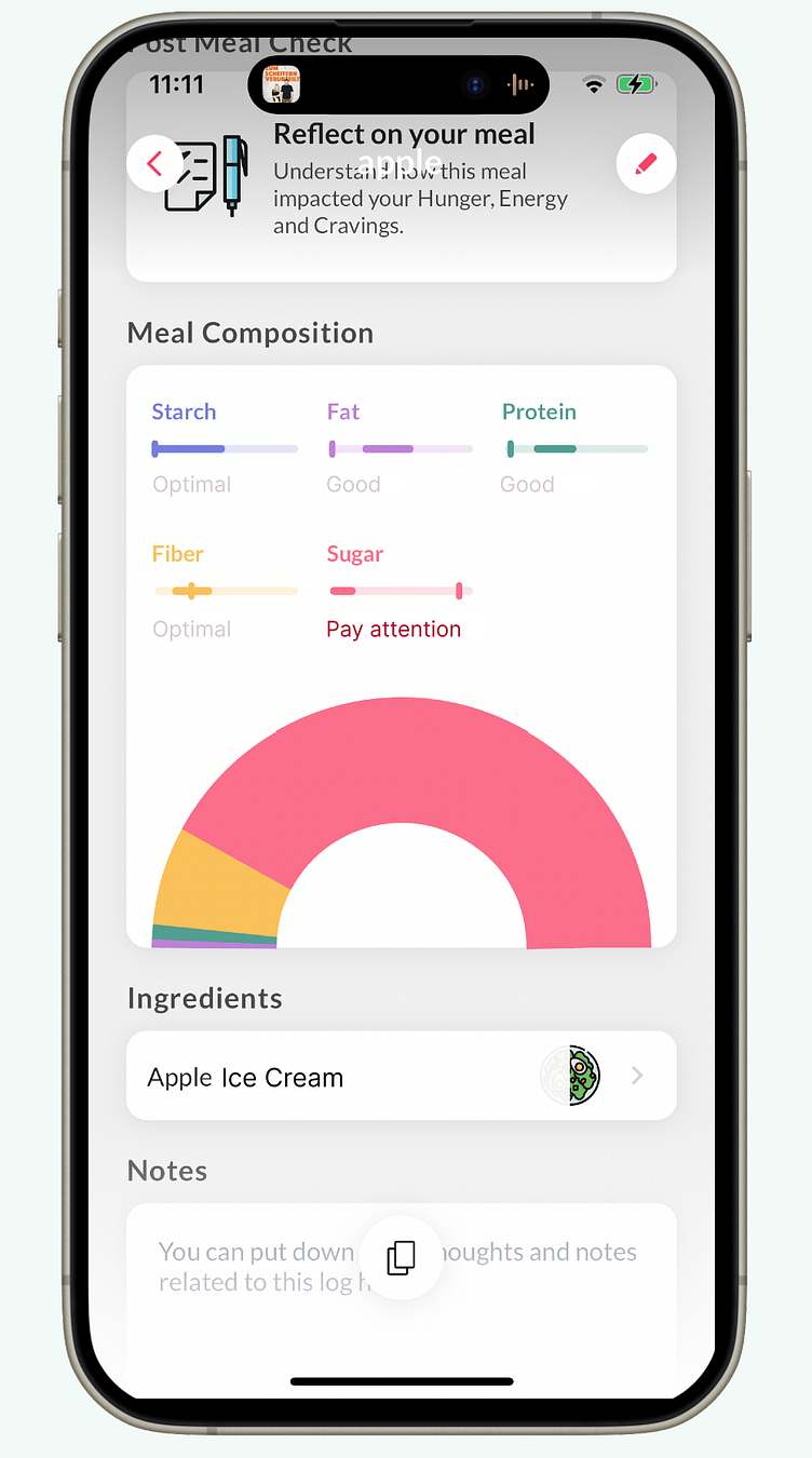
Such wording avoids implying significant mistakes ("too high", "too low") and instead offers gentle guidance, minimizing negative emotional triggers. The distinction I noted between consuming an apple versus apple ice cream illustrates the importance of context in feedback.
I hope these insights prove useful and you're able to incorporate some into your product.
I hope these insights prove useful and you're able to incorporate some into your product.
Hire me.
Looking to enhance your products as well? - Hire me. (recommended)
Cheers, your smart future coworker Franzi 🥂
