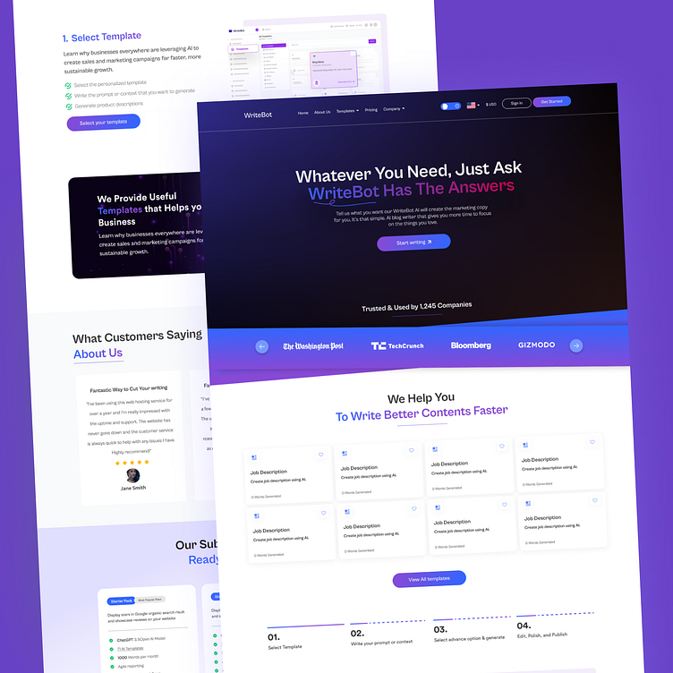
Writebot Web Design
WriteBot is a versatile platform designed to revolutionize the way people interact with AI-powered writing assistants. Its website serves as the primary gateway for users to access WriteBot’s suite of tools, enabling them to streamline their writing process, enhance productivity, and achieve their communication goals.
Objective: The primary objective of the WriteBot website was to create a seamless and engaging user experience that effectively communicates the value proposition of WriteBot's AI-driven writing assistance tools. Additionally, the website aimed to attract and convert potential users by showcasing the platform's features, benefits, and success stories.
Design Process:
User-Centric Approach: The design process began with a thorough understanding of the target audience, their needs, pain points, and preferences. User personas and journey maps were created to guide the design decisions and ensure a user-centric approach throughout the process.
Clear Communication: The website was designed with clear and concise messaging to effectively communicate WriteBot’s key features, benefits, and unique selling points. This included using engaging visuals, descriptive text, and intuitive navigation to guide users through the site.
Visual Design: A clean and modern visual design was adopted to reflect WriteBot’s innovative and sophisticated nature. Bold typography, vibrant colors, and high-quality imagery were used to create a visually appealing and memorable experience for users.
Responsive Layout: With the increasing use of mobile devices, the website was designed to be fully responsive, ensuring a consistent and optimized experience across all screen sizes and devices. This included implementing flexible layouts, scalable fonts, and touch-friendly navigation.
Call-to-Action (CTA): Strategic placement of CTAs throughout the website encouraged users to take action, whether it be signing up for a free trial, subscribing to the newsletter, or contacting support. The CTAs were designed to stand out and prompt immediate engagement from users.
Results: The redesigned WriteBot website has successfully achieved its objectives, resulting in:
Increased User Engagement: The clear and intuitive design has led to higher user engagement rates, with visitors spending more time on the site and exploring its features.
Improved Conversion Rates: The strategically placed CTAs have contributed to higher conversion rates, with more users signing up for free trials and subscribing to the platform.
Positive User Feedback: User feedback has been overwhelmingly positive, with users praising the website’s ease of use, informative content, and visually appealing design.
Enhanced Brand Perception: The modern and professional design of the website has helped to enhance the overall brand perception of WriteBot, positioning it as a leading provider of AI-driven writing assistance tools.
