Apartment Development Website Redesign
Design Brief
Introduction
Any website redesign starts with understanding the purpose and identifying user pain points. Key questions include:
Who visits the website and why?
What user needs are not being met?
What are the primary business goals?
How does the brand want to be positioned?
The "Apartments and Development" (A&D) website presents a clear problem, target audience, and goals. By analyzing their mission, vision, and brand values, I can create a website that empowers Australian off-plan property buyers.
Project Goal
The goal is to create a user-friendly website with informative content that guides buyers through the off-plan property search journey, fostering confidence and a sense of being "at home."
Focus Areas
Hero's Journey: Guide buyers through the process with clear information and a user-friendly search experience.
Trust & Transparency: Showcase expertise with clear communication and valuable resources.
Engaging Experience: Design a website that is informative, engaging, and reflects the brand's unique personality.
Expected Outcome
A world-class platform that attracts buyers, simplifies the off-plan experience, and establishes A&D as the ultimate resource in Australia.
Design Considerations
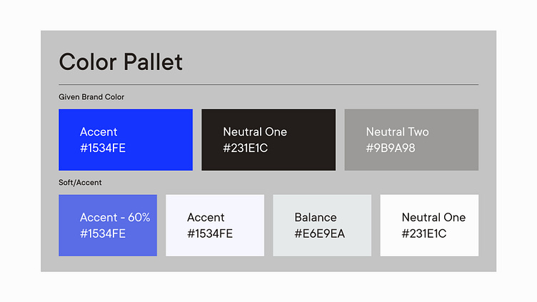
Color Scheme: I got the brand Colors which are Blue, Black and Grey. So, Obviously I applied 60-30-10 rule first. So, 60% would be the white color for background, 30% text and sub text will be black/grey and remaining 10% blue are for Accent.
Brand Personality: The website should cater to the target audience's expectations for a streamlined search experience, while reflecting the brand's focus on trust and transparency.
Website Analysis - Current Issues
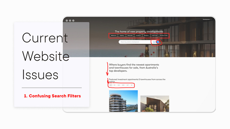
Confusing Search Filters: The current website uses a combination of chip filters, location search bars, and hidden "advanced filters." This complexity hinders user experience.
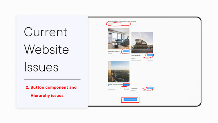
Button Hierarchy: The grayscale test reveals button color hierarchy issues. The search filter button, the most crucial element, should have the highest priority (blue). Other buttons can be softer colors, outlines, or text.
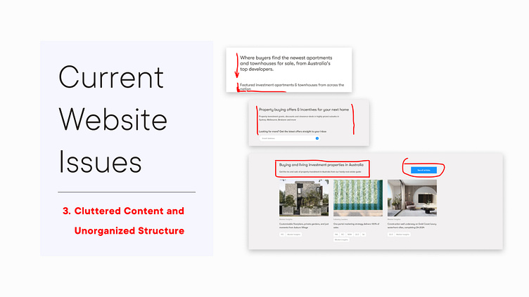
Cluttered Content and Unorganized Structure: The website is overloaded with filters in every section. There's a lack of clear section names and action-oriented microcopy to guide users.
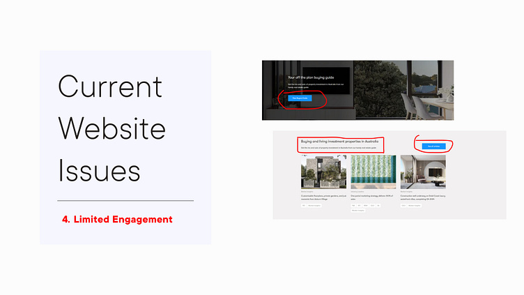
Limited Engagement: No video tours, user reviews, or engaging features are present.
Proposed Solutions
Two Design Variations:
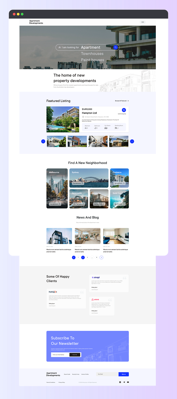
Variant 1
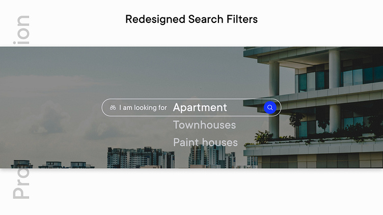
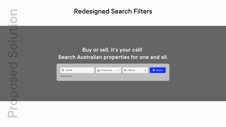
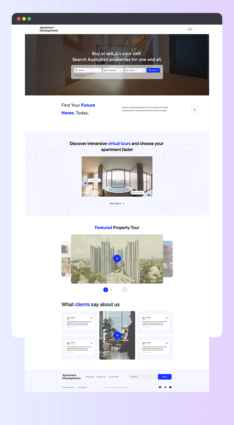
Redesigned Search Filters: I have added two variation of search filters. Focusing on a single goal “What’s buyers are looking” & “Which filter are most appropriate”. Additional search filter will be hidden at the first impression. Buyer will re-direct another page according to their chosen filter.
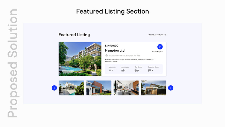
Featured Listing Section: A carousel showcasing property prices, locations, details, and a "Call for Inquiry" option to capture leads.
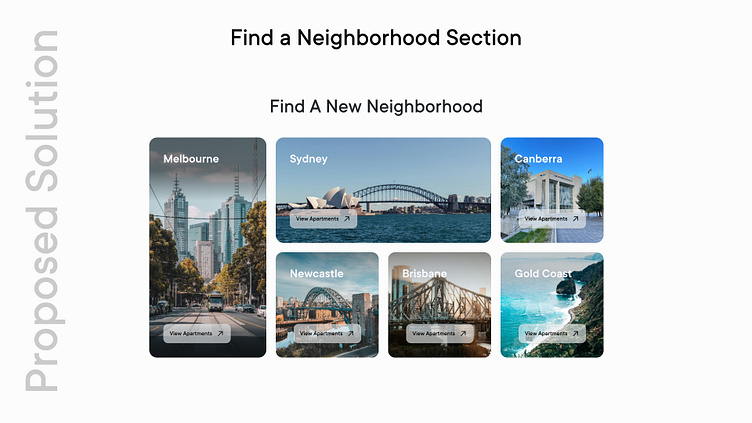
Find a Neighborhood: A filter focusing on popular Australian cities, allowing users to explore available apartments in their chosen location.
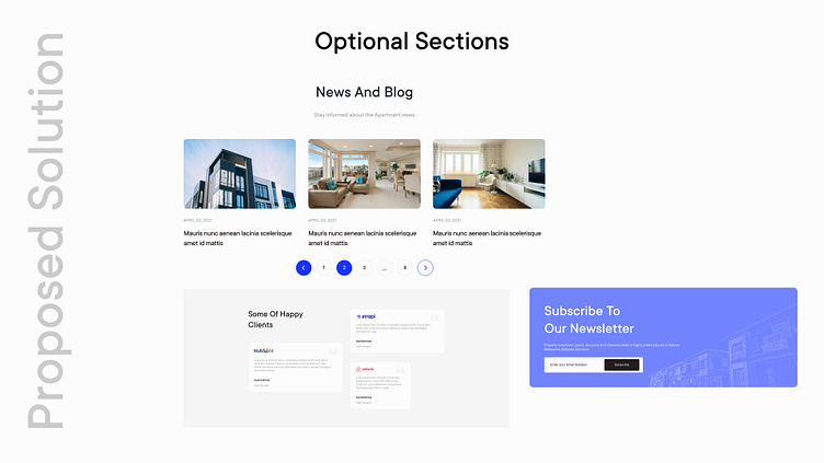
Optional Sections: News & Blog, Client Testimonials, Newsletter signup.
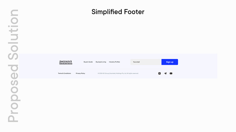
Simplified Footer: Removal of the redundant "Filter" option.
Variant 2
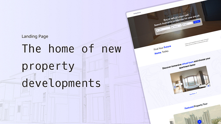
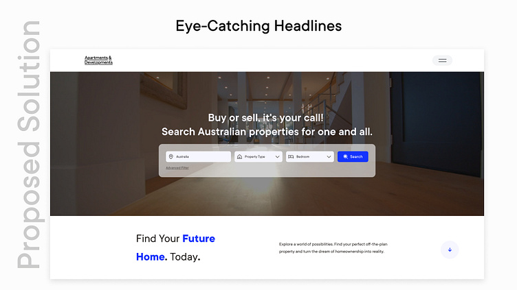
Eye-Catching Headlines: Headers with words like "Dream" and "Future" to trigger emotions and connect with the brand vision of "imagining a world..."
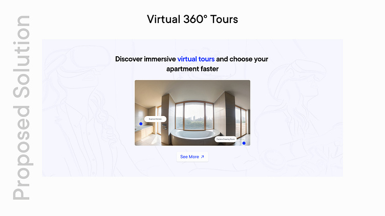
Virtual 360° Tours: Immersive virtual tours allow users to explore apartments remotely.
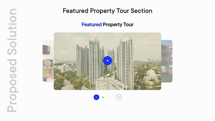
Featured Property Tour: A short video overview of a featured property to grab user attention within the crucial first 50 milliseconds of website interaction.
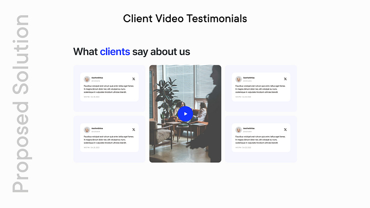
Client Video Testimonials: Positive video reviews from satisfied clients leverage social proof and showcase the benefits of using A&D's services.
Conclusion
Both variants offer significant improvements over the current website. They are functional, align with brand guidelines, and provide a well-structured user experience. Ultimately, A/B testing can determine which variant performs best.
