Kirkland Urban
When Kirkland Urban, a mixed-use development northeast of Seattle, was in the process of adding a third building, it tapped the branding studio People People to reimagine its visual identity. The client desired a more robust brand system than what they currently used, requesting the design capture the development’s unique personality, differentiate it from other projects in the area, and inform not just the new website but a future environmental signage package
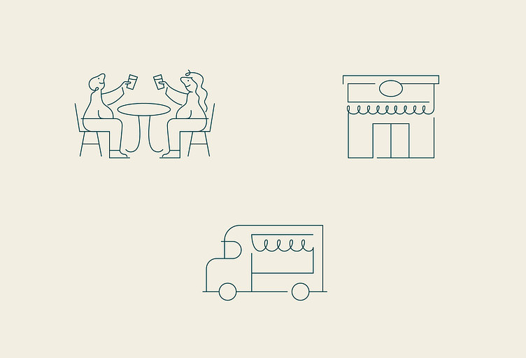
People People conducted local focus groups to drive their work. Designers learned Kirkland residents sought welcoming environments with spaces designed for shopping, dining, and gathering. Inspired by their findings and the development’s diverse array of offerings, PeoplePeople recommended positioning Kirkland Urban as a collection of businesses, spaces, and experiences, each with its own character, coming together in one place. People People created a bright and playful building-block-inspired brand to bring the concept to life.
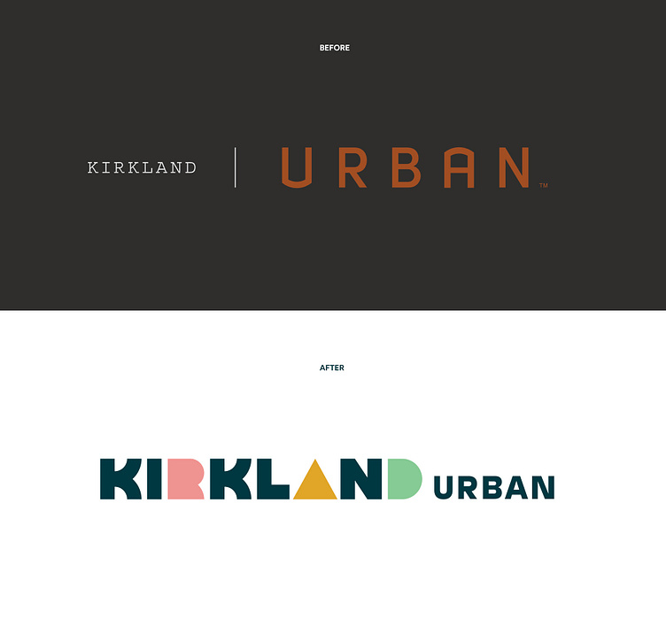
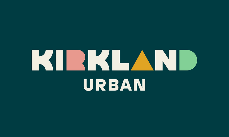
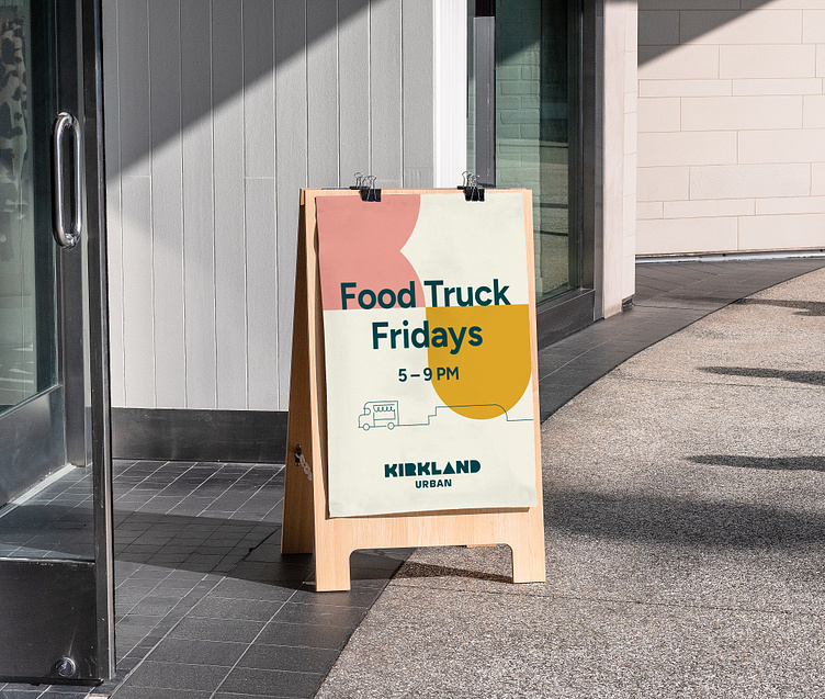
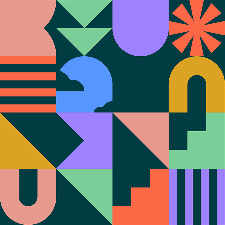
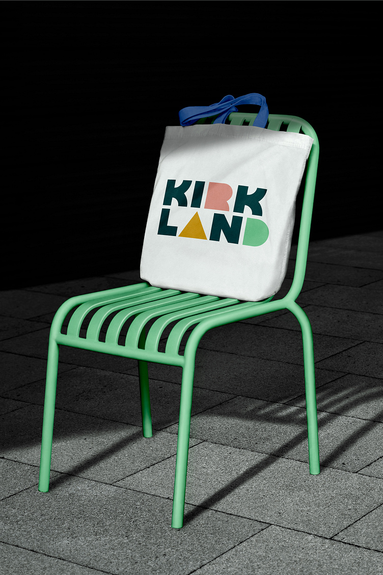
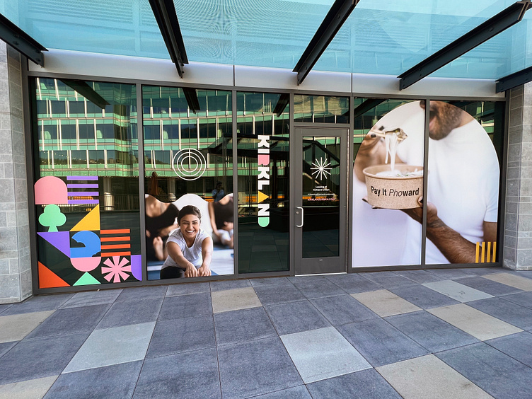
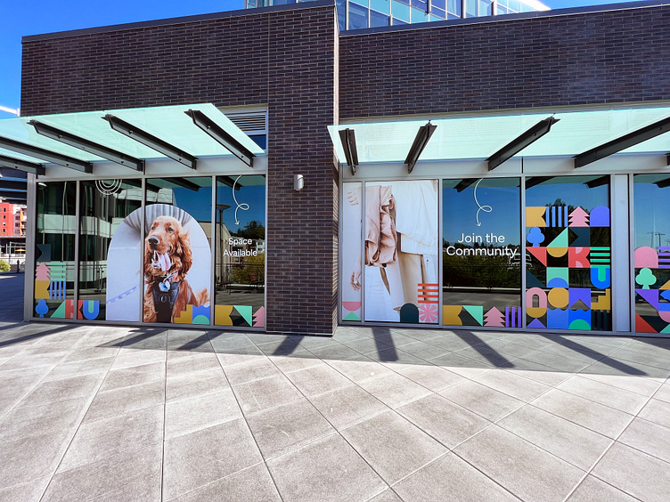
The primary logo features fully custom, geometric typography. People People gave each letter a unique personality as a nod to the many experiences Kirkland Urban has to offer, from restaurants and breweries to salons and clothing stores. Modular, block-like supporting graphics can be used on their own or paired together to form eye-catching patterns. The color palette features an inviting combination of warm and cool hues, including grounding teal, mint green, electric blue, violet, vermillion, bright ochre, and salmon. Over 100 window graphics in these forms and hues are installed around the project site.
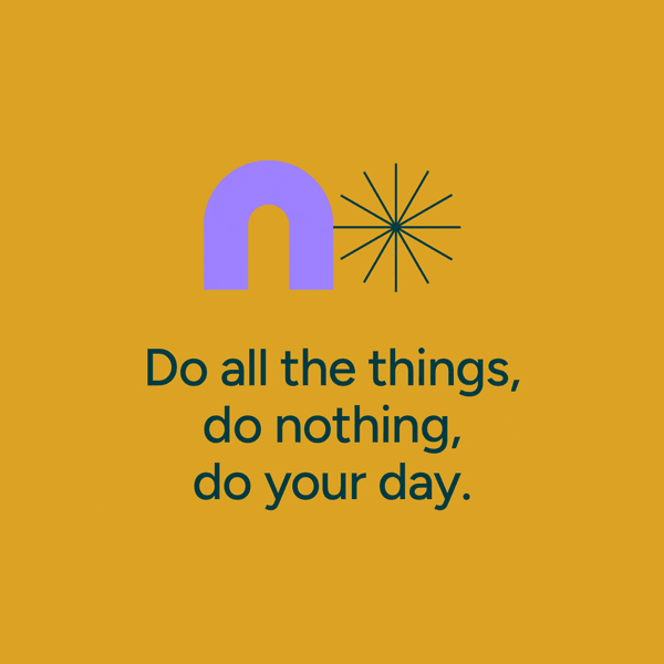
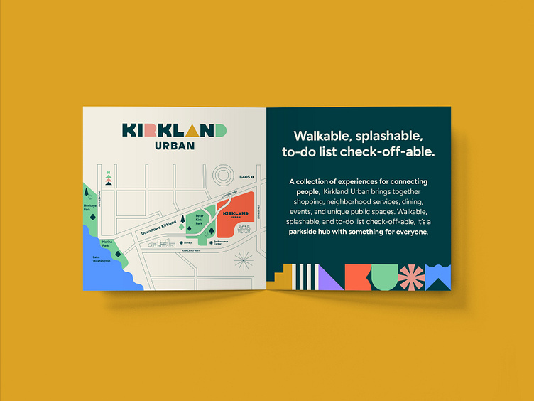
Complementary messaging communicates the concept verbally. People People Creative DirectorShannon Palmer explains, “For a memorable, impactful placemaking brand, it is important that both the messaging and the visual brand come from the same foundation and communicate similar personalities.” Catchy, friendly headlines include “Walkable, splashable, to-do list check-off able” and“Do all the things, do nothing, do your day.”
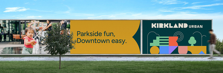
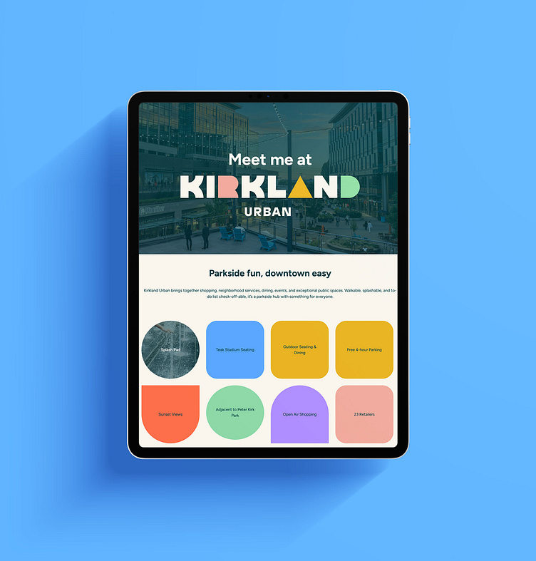
Designed and developed by People People, Kirkland Urban’s new website is a harmonious culmination of the designers’ work. It welcomes visitors with lively animations, upcoming events, and an interactive business directory. The final stage of the project will include a new environmental signage package featuring interactive directories and murals, which is currently planned to roll out in early 2024.
With a fusion of custom typography, modular graphics, and captivating colors, People People captures the essence of not only Kirkland Urban but the broader Downtown Kirkland area. The rebrand reflects the community’s desire for welcoming spaces and establishes the development as a unique and memorable hub in the heart of the Pacific Northwest.