SaaS financial dashboard design
Excited to share my latest design project – a comprehensive SaaS screen offering an intuitive financial summary at a glance!
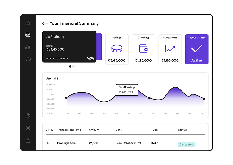
In this sleek interface, users can effortlessly access crucial financial data, dive into detailed card insights, explore analytics, and effortlessly navigate through transactional information.
Key Features:
Financial Overview: Get a holistic view of financial health with essential values presented in a clean and digestible format.
Card Details: Dive deeper into individual cards to glean insights and track specific financial metrics.
Analytics: Empower informed decision-making with powerful analytics tools, providing actionable insights at your fingertips.
Transaction List UI: Seamlessly stay informed about transactions with a user-friendly list UI, facilitating quick access to relevant details.
Navigation: The navigation bar boasts simplicity and intuitiveness, ensuring smooth traversal throughout the platform without any hassle.
Design: I've infused the design with a touch of uniqueness, combining functionality with aesthetics to create an engaging and visually appealing user experience.
Check out the screenshot to witness the seamless blend of functionality and style in this SaaS financial summary dashboard!
