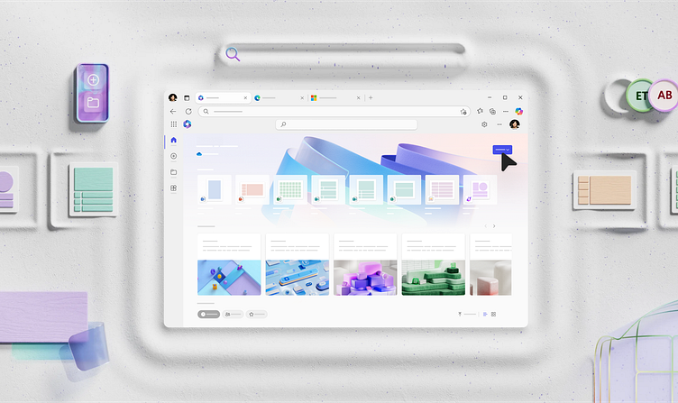
New Teaching UI system
Take a look at the visuals for our new Teaching UI system for Fluent designed to visually guide users through our products, teaching navigation and showcasing new interaction behaviors like Copilot 👀. Our approach combines a simplified UI with dimensional backplates and color palettes to create an effortless and intuitive experience that feels unmistakably Microsoft while also being visually engaging to introduce new features and users.
When we create 3D backplates, as you may have seen in images like our new M365 app store imagery, we aim to capture the essence of each app’s personality in an abstracted manner, designed for focus and optimized for various aspect ratios and themes 💡. Collectively, these elements reduce cognitive load and contribute to a universally relevant, unified system to foster positive relationship with our products.


