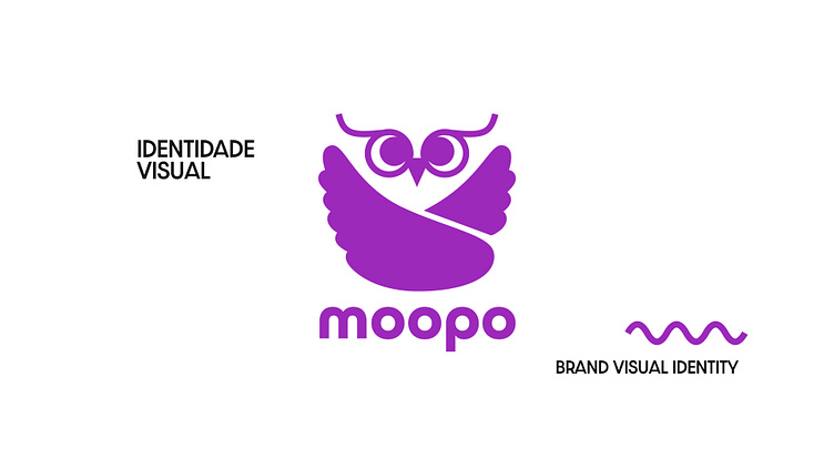
Moopo – Entretenimento sem preocupação
Moopo – Worry-free entertainment
No meu TCC, criamos um aplicativo que oferecia informações de possíveis conteúdos sensíveis dentro de mídias de entretenimento. Esse é o Brand Book que fizemos para nossa marca.
For my school thesis, we created an app that let users get information on the sensitive content that might be present within entertainment medias. This is the Brand Book we made for our app.
ABOUT THE BRAND
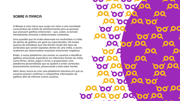
Moopo is a brand that emerged in the midst of a society that consumes entertainment media for people who have emotional triggers – which, therefore, make them mentally sensitive to certain content.
An issue that has been frequently observed in multimedia is the lack of general or specific trigger warnings. There are many complaints from individuals who were unaware of the types of content that would be exposed within the media, and thus ended up triggering negative emotional responses.
So, our platform aims to help users identify specific emotional triggers in different forms of media, such as films, TV shows, games and books; and provide a personalized platform that helps them avoid potentially sensitive content, preserving mental well-being.
Furthermore, we seek to create an interactive platform where users can confirm and share triggers information in order to inform other users.
WHY THE NAME?
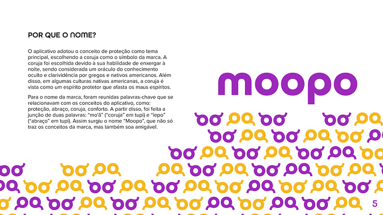
The app used the concept of protection as its main theme, choosing the owl as the brand's symbol. The owl was chosen because of its ability to see at night, and was considered an oracle of occult knowledge and clairvoyance by the Greeks and Native Americans. Also, in some Native American cultures, the owl is seen as a protective spirit that wards off evil spirits.
For the brand's name, keywords were gathered that related to the app's concepts, such as: protection, hug, owl, comfort. From this, two words were combined: “mo'ã” (“owl” in Tupi) and “îepo” (“hug” in Tupi). This is how the name “Moopo” came about, which not only conveys the brand's concepts but also sounds friendly.
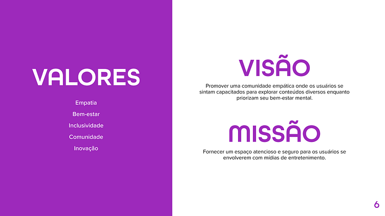
VALUES
Empathy. Well-being. Inclusivity. Community. Innovation.
VISION
Foster an empathetic community where users feel empowered to explore different types of content while prioritizing their mental well-being.
MISSION
Provide a thoughtful and safe space for users to engage with entertainment medias.
MAIN LOGO
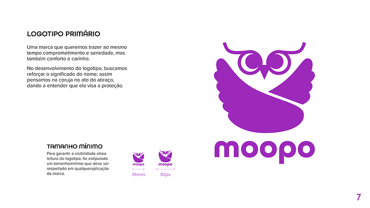
A brand in which we want to bring, at the same time, commitment and seriousness, but also comfort and care.
When developing the logo, we sought to reinforce the meaning of the name; that's how we thought of the owl giving a hug, implying that it aims for protection.
PROTECTED BRAND AREA
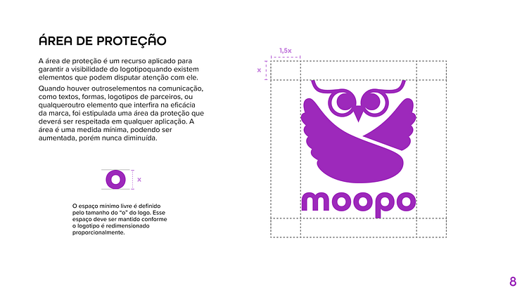
The protected area is a feature applied to ensure the visibility of the logo
when there are elements that can compete for attention with it.
When there are others elements in communication, such as texts, shapes, partner logos, or any other element that interferes with the effectiveness of the brand, an area of protection was stipulated that must be respected in any application of the logo. The area is a minimum measurement and can be increased, but never decreased.
COLOURS
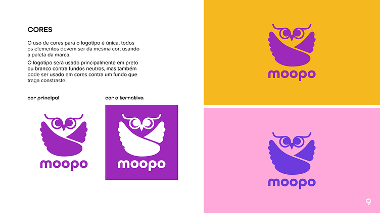
The logo can only use a single colour, so all elements must be the same colour; using the brand's palette.
The logo will be used primarily in black or white against neutral backgrounds, but can also be used in color against a contrasting background.
TYPOGRAPHY
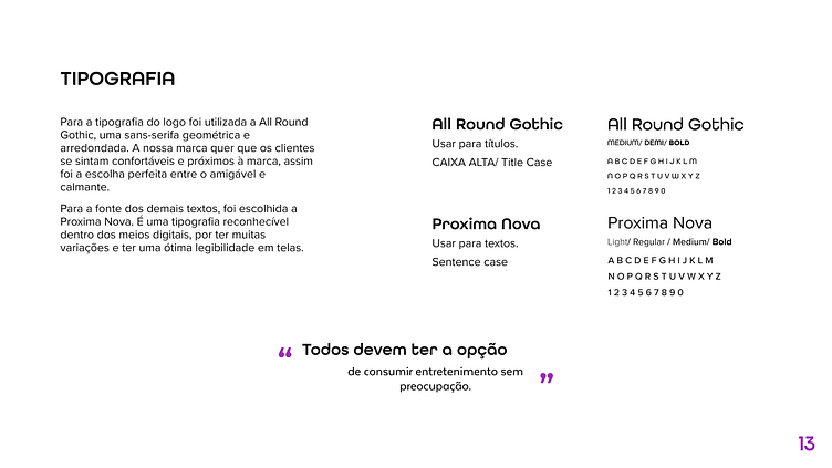
For the logo's typography, All Round Gothic was used, a geometric and rounded sans-serif. Our brand wants customers to feel comfortable and close to the brand, so it was the perfect choice between friendly and calming.
For the font of the other texts, Proxima Nova was chosen. It is a recognizable typography within digital media, as it has many variations and excellent readability on screens.
COLOUR PALETTE
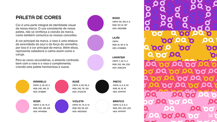
Colour is an integral part of our brand's visual identity. The consistent use of our palette not only reinforces the cohesion of the brand, but also communicates our concepts.
The brand's main colour, purple is a mix of the serenity of blue and the strength of red, which is why it is the brand's main colour. Furthermore, it represents wisdom and calm, just like the owl.
For secondary colours, yellow contrasts well with purple and pink complements it; creating a harmonious and soft palette.
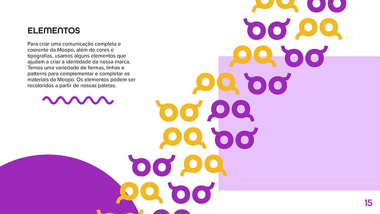
ELEMENTS
To create a complete and coherent communication from Moopo, in addition to colours and typography, we use some elements that help create our brand identity. We have a variety of shapes, lines and patterns to complement and complete Moopo's content. Elements can be recolored using our palette.
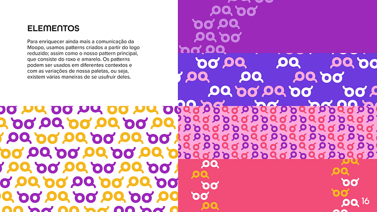
ELEMENTS
To further enrich Moopo's communication, we used patterns created from the reduced logo; as well as our main pattern, which consists of purple and yellow. Patterns can be used in different contexts and with variations in our palettes, meaning there are several ways to use them.
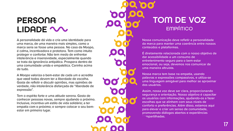
PERSONALITY
Personality gives life and creates an identity for a brand, in a simpler way, as the brand would be if it were a person. In Moopo's case, it's calm, encouraging and protective. It is intended to protect and comfort. Not afraid to stand up to intolerance and insensitivity, especially when it comes to obnoxious ignorance. It thrives within a united and empathetic community. Affection above all.
Moopo values each person's well-being and believes that everyone should have freedom of choice. It likes to reflect and discuss opinions, but real opinions, not intolerance disguised as “freedom of expression”.
They have a strong spirit and a calm attitude. They like to meet new people, always helping others. They even encourage a supportive lifestyle; to have empathy with others; and always put your well-being first.
BRAND VOICE
Our communication must reflect the brand's personality to maintain coherence between our content and platforms.
It is directly related to our objective of providing accessibility to safe entertainment consumption for emotional well-being, that is, we must communicate in an altruistic way.
Our brand is based on empathy, using compassionate words and expressions, and friendly language to better approach users.
Therefore, our voice must be clear, providing security and guidance. Our goal is to empower users with information, helping them make choices that align with their comfort levels and preferences. Additionally, we are here to uplift and create a sense of community by promoting open dialogue and shared experiences.
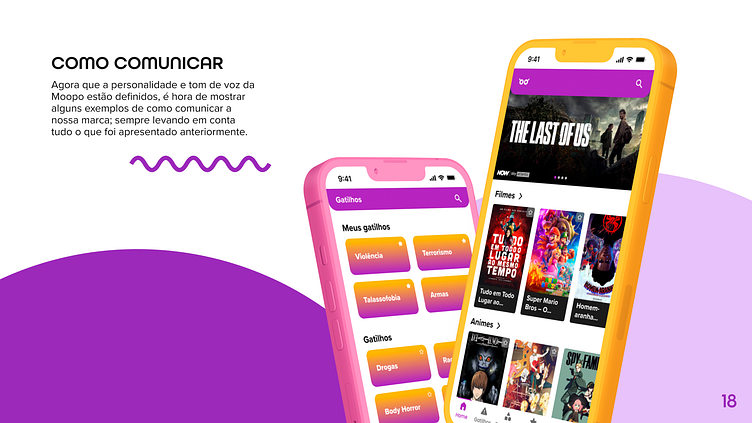

The app's prototype on Figma.
The beta version is available on Android in the Play Store.
Sabrina Kaori Uchima
Sabrina Sousa Lima
Centro Universitário Belas Artes, 2023.
