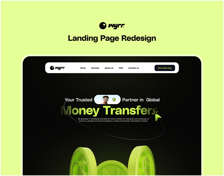
Wyrr Landing Page Redesign
Landing Page
I revamped the Wyrr homepage with captivating 3D design elements, enhancing interactivity for a more engaging experience. Streamlined text ensures effortless navigation, while strategic use of colors delineates sections, establishing a visually pleasing hierarchy. Through experimentation with various landing page styles, one ultimately resonated with me.
Check out the full design here: https://www.behance.net/gallery/194862003/Wyrr-Landing-Page-Redesign
More by David Sampson View profile
Like
