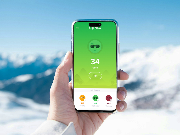
AirLief App and logo - advisor for polluted air
AirLief shows the air quality in the region and provides personalized health protection tips, including whether you need to wear a mask that filters polluted air.
The first challenge was to create an attractive, clear, and intuitive UI design to display air quality information.
My role: Designing the user interface, branding, and prototyping the app.
Design Challenge
To differentiate the six Air Quality Indices (AQI) – good, moderate, unhealthy for sensitive groups, unhealthy, very unhealthy, and risky – a wide color palette was chosen, ranging from green to burgundy.
Need a Design Expert?
I'm available for freelance Product & Brand Identity projects.
Get in touch: vera.cires@gmail.com
More by Vera Cherry, Digital designer View profile
Like


