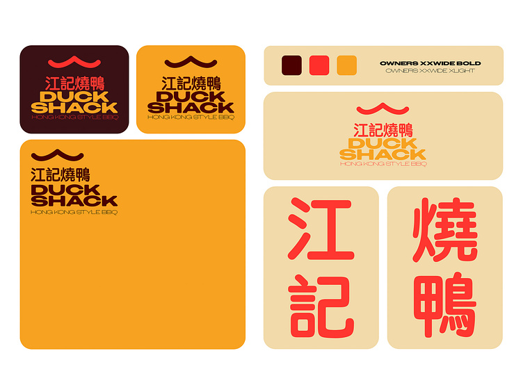
Duck Shack Brand Board (Concept)
Using the 'Owners' on Adobe Fonts can make anything look great. I curved the edges, to soften the look. Used a colour palette inspired by that of Chinese lanterns.
More by Harry Lakin View profile
Like
