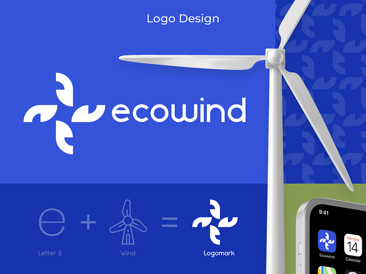
Ecowind Energy Logo
To capture the essence of renewable energy, we crafted a logo for Ecowind that centered around a stylized windmill. We explored both classic and modern design elements, ultimately landing on a simple illustration that conveys strength depending on the chosen style. The color palette reflects the natural world, with blues representing the open fields and sustainable energy harnessed by the windmills. This logo is designed to be memorable, impactful, and to leave a lasting impression that aligns with Ecowind's commitment to clean power.
➡️ View Full Case Study
More by WingsTech View profile
Like

