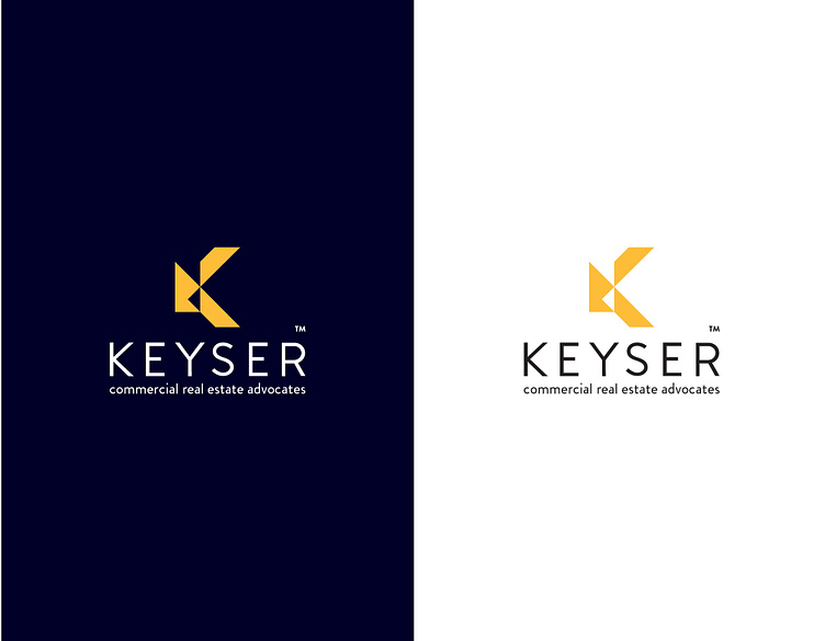
Rebranding for Keyser Commercial Real Estate
Keyser is centered around the core value of trust. We have artistically conceptualized the structure of the letter “K” by employing abstract shapes, recognizing that each building or client we encounter is unique. The diverse array of shapes forms the foundation of the Keyser “K”, symbolizing our adaptability to various structures and clients. Additionally, the Keyser “K” embodies our purpose through the incorporation of 16 columns, each representing one of our guiding principles.
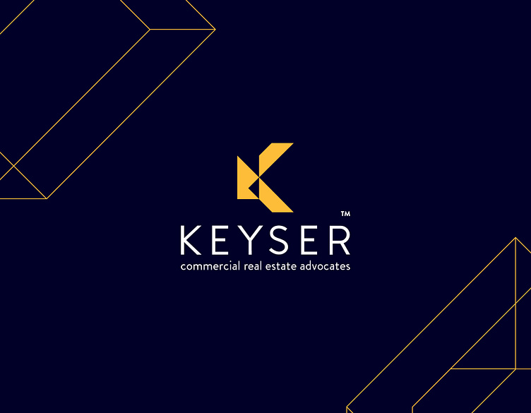
Keyser Structure
We have artistically interpreted the letter “K” in our logo to create a distinctive building pattern. This pattern draws inspiration from Keyser’s existing logo, introducing a structured and layered visual element to the brand. The design not only captures the dynamic essence of a building but also symbolizes Keyser’s commitment to assisting tenants in building their businesses from the ground up. This building pattern serves as a visual representation of the depth and reliability that Keyser brings to its brand.