NOMATIC | CRO
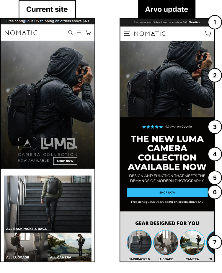
Branding is very important, full stop... I love a good brand that is sleek and functional and does not feel in your face. I have 2 NOMATIC bags and use them for everything: travel, gym, Disneyland, etc. As a value add, I isolated 7 quick wins for the website. See below for the breakdown!
1) Optimize your announcement bar by adding a clear call to action. Give users a clear link to click on so that they can enter the purchase funnel without hesitation.
2) Let’s separate the hero image from the hero text. Give users time to focus on each message separately.
3) Highlight your social proof by bringing your reviews above the fold and into the hero text. Let users know that customers love your products on the most trusted websites like Google.
4) Entice the users to take action by featuring headlines that are bold and unique. Try to stay away from generic headlines that don’t convey excitement about what you are promoting.
5) Be sure to include a statement about what your products are above the fold. Introduce your business to new users quickly and efficiently without any confusion.
6) Make sure that your CTA buttons are full-width on mobile to ensure that they are easily clickable.
7) Try showcasing your collections using tabs for users to explore. This will cut down on the amount of screen real estate being used and allow for your products to be featured higher on the page.
