CRM Interface Design
Hey Dribbble! Monday is the high time for planning 📆
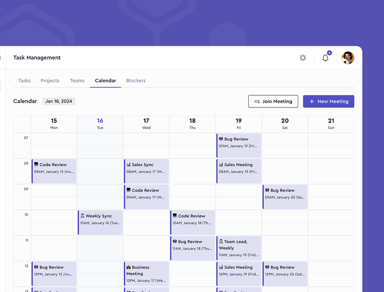
A seamless CRM design can make planning much more enjoyable. When developing our concept, we emphasized clear components and overall design consistency so users could intuitively click and move to the required CRM areas.
An interface built on familiar drafts allows you to spend way less time getting used to the system and view the components effortlessly. This calendar page has no excessive elements - just a convenient table scheme and distinctive buttons.
Less is more - do you agree? Let us know! 💜
Follow us on
LinkedIn | Facebook | Instagram
or talk to us
More by Honeycomb Software View profile
Like
