RVCA Website Explorations
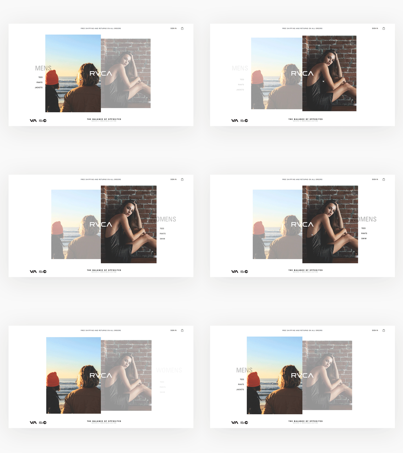
Some very early and fun explorations for the new RVCA website that didn't make the cut :)
The idea behind this was doing a take on their "Balance of opposites" theme. I was exploring with a potential global landing page that takes you to a gender specific shopping experience.
I included optional featured category links without having them be placed in the middle as a hover state. That way its not too pushy in the shopping aspect but at least gives them the option to skip to "Tees" for example. Users are not forced to read or click on specific button.
More by Andrea Montoya View profile
Like
