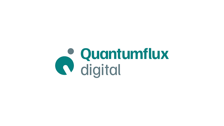
Logo Design: Quantumflux Digital
The logo for Quantumflux Digital cleverly incorporates the concept of negative space.The letters of the upper case "Q" and lower case "d" are intertwined, utilizing the space within and around them to create a distinctive visual.
This design resembles an orbital structure, evoking the imagery associated with quantum physics and digital marketing.
By merging the negative space of these letters, the logo symbolizes the synergy between the scientific principles of quantum physics and the innovative strategies of digital marketing.
Both fields rely on precision, experimentation, and exploration, making the combination not only visually striking but also conceptually meaningful.
More by Neal Strydom View profile
Like


