Hospital Website Design Concept
💌 Have a website idea? Let's bring it to life together!
hello@ronasit.com | Telegram | WhatsApp | Website
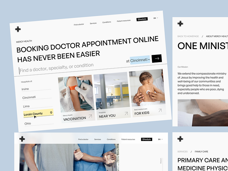
Hello everyone! We’d love to share our redesign concept for Mercy Hospital's website, a healthcare institution with the mission of providing assistance to those unable to afford care.
The redesign touches several key areas of the site, including the homepage, articles, and mission statement sections, all reimagined to more effectively communicate Mercy's values and services.
Our color scheme was inspired by the idea of compassion and mercy, interpreted as ethereal and angelic with a serene, sky-blue tone. We introduced splashes of lemon yellow for a subtle yet inviting contrast.
The central characteristic of this redesign is its harmonious alignment with the hospital's mission, providing an intuitive user experience. This ensures that individuals seeking help can quickly find the assistance they need, reflecting the hospital's commitment to service and care in a visually engaging way.
Hospital Website


