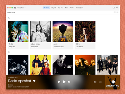
Daily UI #009 - Music Player
(see attachment for full-size image)
For today's #dailyui challenge, I took on a behemoth: iTunes. I know. I tried to do it in 45min, but ended up taking close to 1.5 hours again. Starting Monday I'm gonna start focusing more on either UX or visuals, and not trying so much to come up with something this final. I guess it's part of the process.
I don't know anyone who loves the iTunes desktop player, so I took some of my favorite features from Spotify and Rdio and tried to rethink.
One of my pet peeves about iTunes is that center-top bar they've kept there since the first version of the app. I believe it has to go.
I ripped off Spotify's record grid because I think it makes albums look a lot nicer than the giant and unusable iTunes album grid view.
The bottom area is something I pulled from Rdio (RIP!) because if there's something iTunes doesn't have is immersion. The app feels like an utility, and for me music MUST have some emotional connection. Rdio did an amazing job of that.
Do you like it? Any thoughts?

