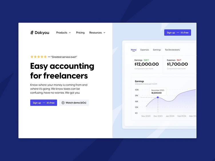
#13 - Dokyou Hero
Design: Hero section concept for an imaginary company.
Goal: Creating a minimalist hero section that is packed with information but doesn't feel overwhelming.
Mentioned that getting started is free on the CTA buttons to increase conversion.
Included a short testimonial with 5 stars to communicate user satisfaction.
Added a screenshot from the app's UI to show users exactly what to expect.
This also helps with showing the app's features. People can tell what it's doing without scrolling further.
Financial services are usually hard to understand. Taxes are especially confusing and scary. To make the service more approachable and easy-to-digest, I used very simple English and kept the language informal.
Included a demo video and mentioned its length, so that people know it's an easy time investment.
Used a limited color palette to highlight the CTAs better and avoid overwhelming the user.
✉️ Contact me via email pinarhaskiris1900@gmail.com
