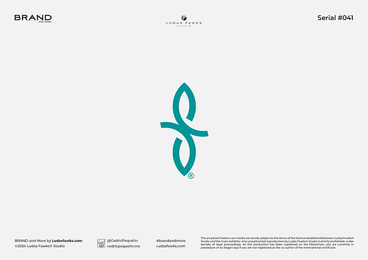
Logo | Shifcare®
Logo Shifcare® | Natural Well-Being
Shifcare® is a company marketing natural and therapeutic products.
On this design, the original idea was to highlight the natural side. The leaf being one of the most obvious icons - to the point of being one of the only semiological attributes clearly embodying nature - we opted for this design choice.
However, a light and elegant layout was required, which could naturally form the letter S.
We therefore stylized two minimalist leaves, with clear and graceful curves, to form the pictogram.
_______________________________________
Ready to Work on yours?
and make something great with your project !
_____________
What We Do
Contact
> What'sApp | > E-mail : hello@cedricpoquelin.me
Let's Follow
> Behance | > Instagram | > Facebook > Linkedin
_____________
© 2024 Ludas Fawks® Studio X Cédric Poquelin. All Rights Reserved.


