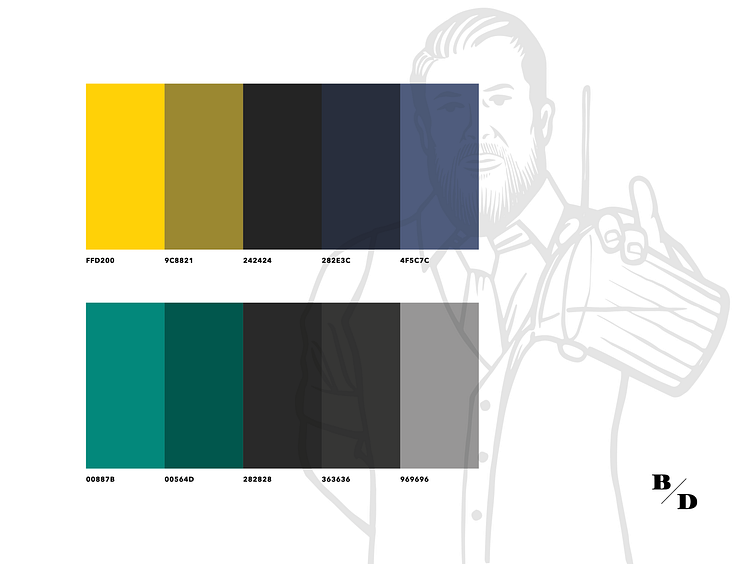
Bartender's Depot / brand palette
I'm pretty fond of this color palette. Kinda reminiscent of the Seattle Supersonics! This was a carefully chosen palette, meant to convey a bartending / alcohol feel, while also doing everything possible to stay away from anything associated with the word "depot" ...for obvious reasons.
More by Luke Dubois View profile
Like
