Le Curry Branding Case Study
Le Curry
The escalation of unhealthy food practices within the African food industry has
surged, due to a lack of awareness. Le Curry primary aim is to provide accessible
seamless and healthy food options at the most affordable prices possible.
Our goal is to enable people to consume nutritious meals, promoting better
living and overall well-being.
To ensure Le Curry remains aligned with its core purpose and values, we have been tasked with crafting a comprehensive strategy encompassing brand identity and visuals. These elements are to resonate with exotic characteristics, exude vibrancy to capture attention, and be adaptable to various contexts as needed. Additionally, the communication approach should reflect friendliness and distinctiveness.
Services:
Brand Name
Brand Strategy
Logo Design
Brand Identity & visual design
Packaging Design
About the logo
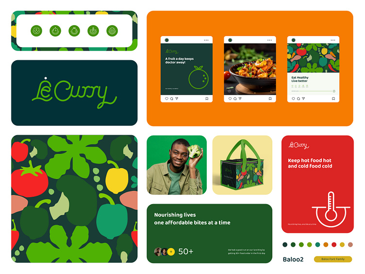
With friendly, exotic, and unique intent, we approach “The logo”, which plays a huge role in brand identity, With research, sketches, and development, after a thorough and diligent process, a monoline type of logo choice was made since it conveys what was intended, despite a lot of premade monoline fonts than
can be altered to give the result, we decided to design and develop the monoline letters for the logo from scratch to maintain uniqueness
Typography & color
Since the monoline used for the logo was created solely for the logo. We chose a supporting typography named “Baloo” an affable display typeface designed by “Ek Type.” Baloo 2 is an improvement of Baloo project.
Also We took a diligent approach to color selection in the branding process. According to the brand brief , the needs are colors that will communicate healthy, organic, fresh, energy, quality, vitality, and we did just that.
Icons for packaging
The brand promise is to make every food delivered healthy and on time, with fruits, fruit extract, and clean water, all served at the right temperature that will always satisfy consumers, so the icons were developed to communicate the exact promise.
Illustration
Contrasting to the brand activities, we developed illustrations around elements in the food process, which was complemented by the brand colors. The illustrations will be applied n the brand assets, which will add to its sense of meaning, and communication and nevertheless make it stunning
Packaging Design
The packaging design is a very big part of the branding, and it should communicate effectively about what the brand is all about and, on the other hand, inform and entertain the targeted audience, So what we did was, we design the packaging with illustrations and icons on it, which speaks exactly about the brand promise
Stationaries Design
Stationery is one of the essential parts of the brand asset; the brand needs constant reminder of its promise to its audience, so the stationeries that will be used in the business activities have the brand promise inscribed as a subtle reminder
Other Collateral Designs
Collateral design plays a pivotal role in establishing a cohesive brand identity. every element reflects the essence of "Le Curry" its unique flavors, cultural inspiration, and culinary experience.


