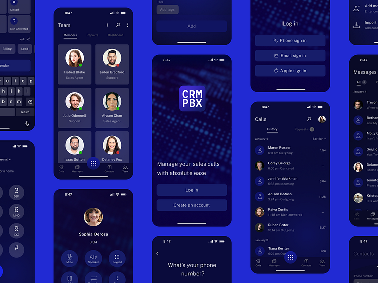
Design concept for the CRM mobile app
Here is a interface design concept for the CRMPBX mobile application for iOS devises. First three screens that you see below help users to pick the way their journey on this application starts.
Next three screens show exactly how the sign in with mobile phone number happens in the concept.
Contacts' base and a new contact creation are some other crucial funtions
As the CRMPBX is tailored for working in teams, one of the navigation tabs is dedicated to a list of team members. The button in the center of the tabbar is used for making calls
As the CRMPBX is tailored for working in teams, one of the navigation tabs is dedicated to a list of team members. The button in the center of the tab bar is used for making calls.
Thank you for going over these screens with me! I'll appreciate your feedback!


