Book Cover Case Study
THE CHALLENGE
Design a book cover for “Renter Nation: the Unaffordability of the American Dream” a data-driven analysis of how America is transforming from a haven for homeowners into a nation of renters. Create a design that is immediately interpreted as an editorial thought piece, a comment on the state of the economy: attracting readers who like to read Freakonomics, Malcolm Gladwell books, Factfulness, etc.
THE STRATEGY
I began my research by exploring the themes of this book. After a discussion with the client, I brainstormed a list of terms that related, however distantly, to the book. With refinement and continued brainstorm a few key words came to the top.
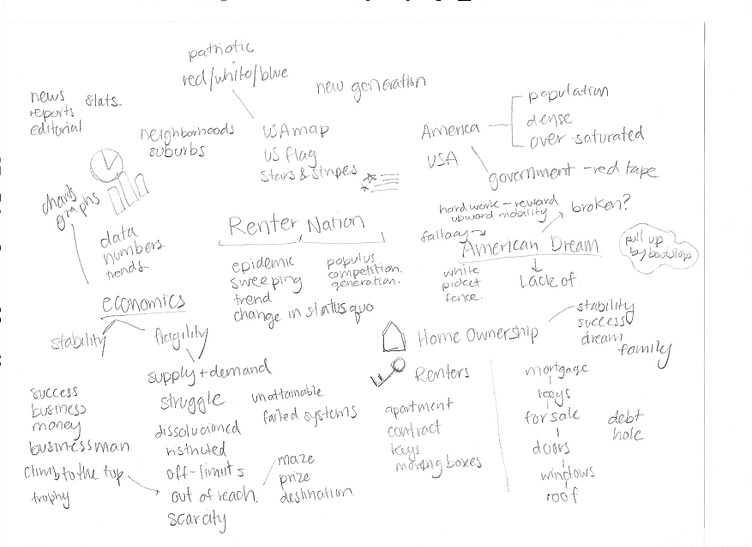
I then thought about how I could represent these themes with visuals:
American Dream / lack thereof: USA map, American flag, stars and stripes, red white and blue, white picket fence
Homeowner vs renter: House, apartment building, key, lock, door, window
Economic struggle / frustration: Out of reach, climbing stairs, unattainable prize, maze, square peg in a round hole
Supply and demand: Many houses, suburbs, neighborhoods, graphs, downward arrow
Scarcity: Off limits, locked, chains, few houses / many people, red tape
Striving for dreams / success: Climbing stairs, person with briefcase, trophy, reach the top, planted flag on peak
Economic or social commentary books often feature a central, thought-provoking image that has dual meaning or inspires a visceral reaction in the reader. I wanted to present a recognizable symbol and alter it unexpectedly to grab the reader's attention. Seeing how other successful covers produced dual meaning in their symbols, I looked over my brainstorming to find opportunities to combine visuals and themes. I began to sketch out some of these visuals to see how they could fit together.
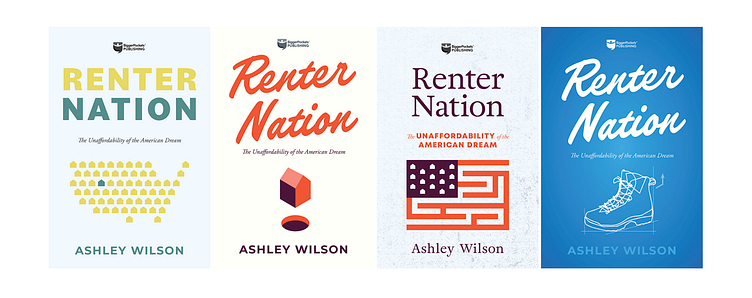
Concept 1: Scarcity of supply, map of the USA, housing scarcity, competition, saturated market
Concept 2: Square peg in a round hole, dreams out of reach, housing market
Concept 3: The American flag/the American dream, the maze of the economic/housing system
Concept 4: Pulling up by your bootstraps, self-starters, the American dream, blueprints; housing and planning
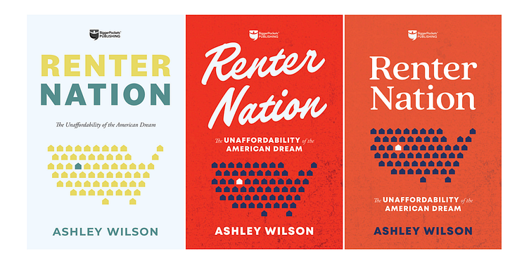
Once I had worked out a few of these concepts, I presented them to the clients and got their feedback. The client found the USA map, and USA flag concepts the most compelling. I put together some additional interpretations of the USA map concept, experimenting with color and type.
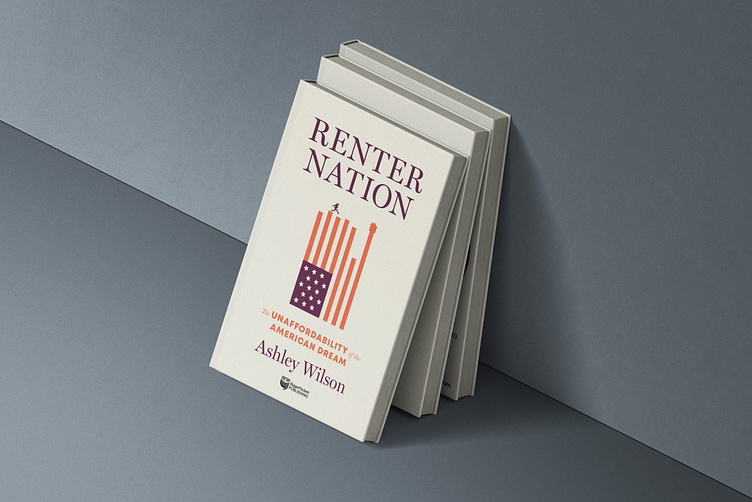
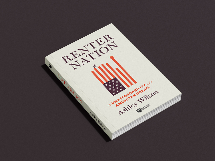
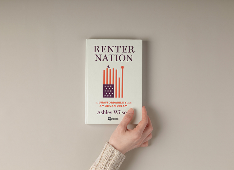
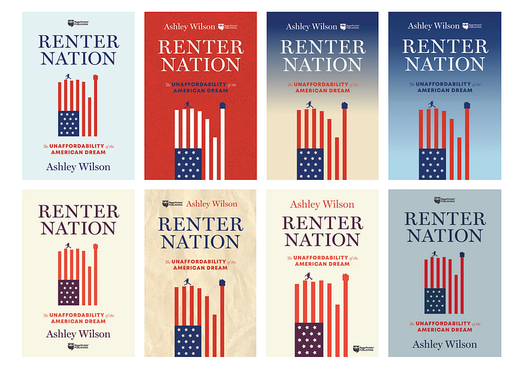
The flag imagery as a maze wasn’t conveying the right tone, so I did a few more explorations on this symbol. I ended up with this concept: a flag tipped on its side so the red stripes imitated a bar graph, connecting the theme of economics that would be explored in the book. I included a small silhouette of a figure leaping from one bar to the next, as if climbing stairs. The last bar is impossible to reach; symbolizing how home ownership has proven to be out of reach for many americans.

The client loved the symbolism in this option, so we explored a few layout and color variations to find the best uses of contrast and hierarchy for the title to stand out and the imagery to be recognizable from a distance. We also added a house icon to the last “bar” of the flag to indicate a discussion of real estate themes and show a striving towards home ownership.
THE RESULTS:
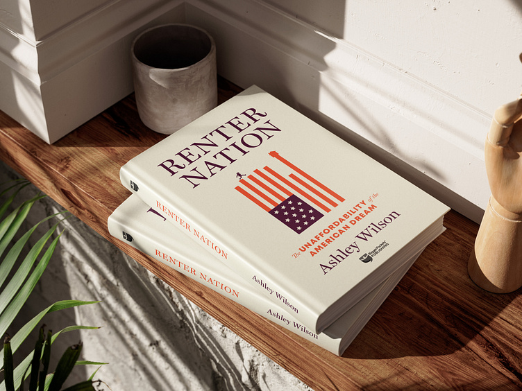
In the end we chose a cream background to compliment the bright red stripes of the flag, a serif font for the title that felt authoritative and knowledgable, and a chunky subtitle font that could be read from a distance. The layout had plenty of white space for a clean look that highlighted the emotions in the illustration. We wanted readers to be drawn into the book by a visceral reaction the the cover, this design accomplished that by leveraging symbolism, hierarchy, and typography.