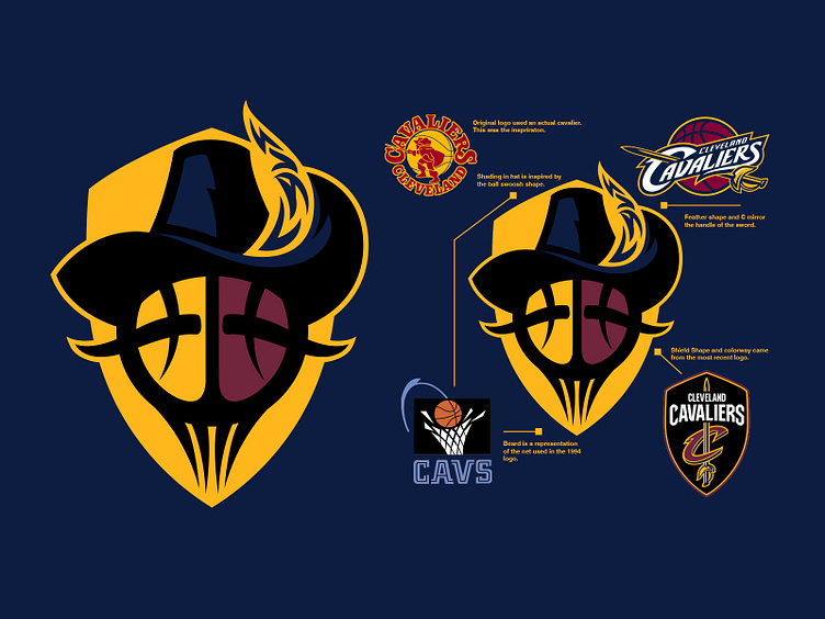
Cavs Logo reimagined
I was asked to compete against another designer on https://superdesignbowl.com (votes would be appreciated) to redesign the Cavs logo. I really wanted to think outside the box so rather than throwing some swords behind a ball I took elements for the previous logos to come up with something different and playful. I ultimately see this as a secondary logo and maybe the primary would lose the text in the father and the badge and add some typography that would work better on a jersey stand alone. I may revisit the concept later down the line.
More by Colin Gauntlett View profile
Like
