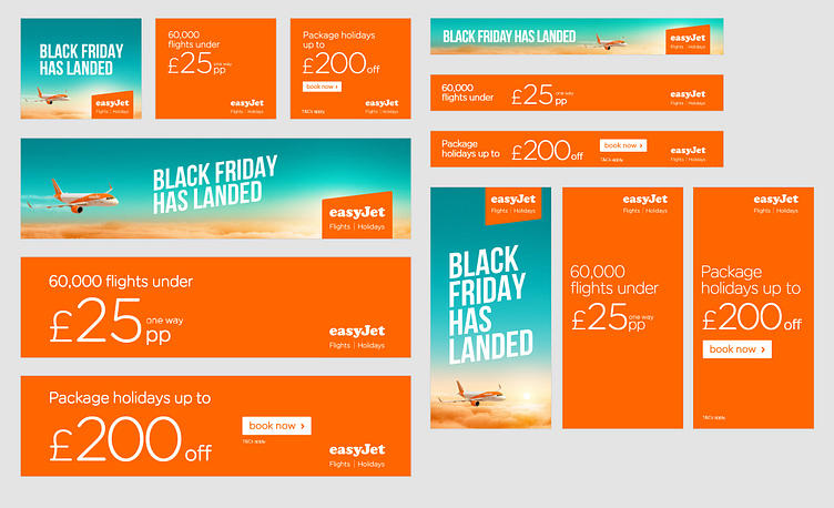
Storyboards - Digi Display Best Practice
We've come a long way in our understanding of digital ads. From the heady days of ultra-invasive Flash page takeovers, through their rebirth in HTML as little more than gifs (thank you, Steve Jobs) and now an amalgamation of techniques used in both to generate more visually striking ads with dynamic content.
Here's my recipe for a successful digital display creative…
BE COMPELLING. Banner ads must be eye-catching enough to attract attention, only then does your marketing message have the opportunity to break through. Things like animation, clear product shots, brand colours, brand icons and clear text help banner ads stand out.
BE CONCISE. At any given moment, someone might see a banner ad and only pay attention to it for a moment. In that moment, be concise to make sure your message sticks.
BE CLEAR. Banner ads are, generally, relatively small, so you don't always have a lot of space to work with. Don't try to say too much; the ad may look cluttered. Instead, communicate a single marketing message about a single product. The need for clarity goes for call-to-actions, these should be strong and eye-catching. Avoid using “Click here”, instead use a succinct action like “Find out more” or “Get a quote”.


