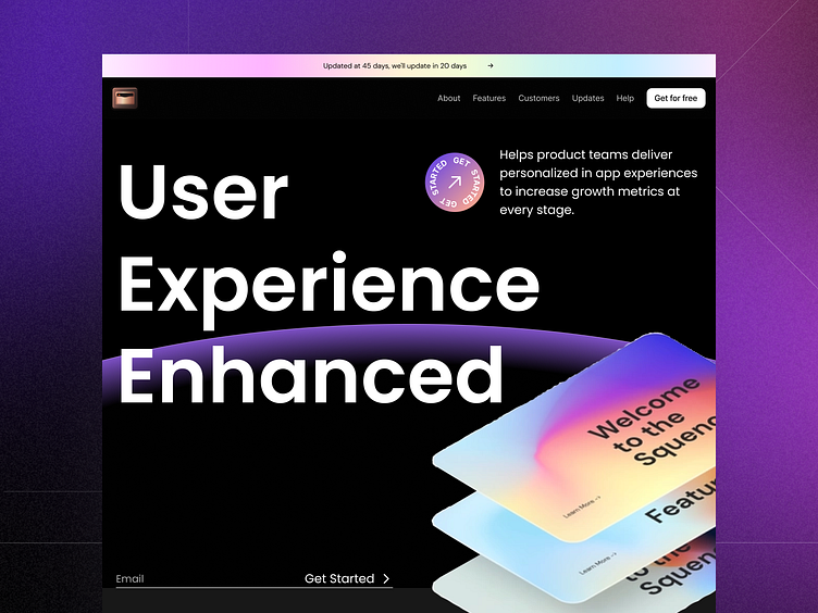
Banking SaaS website landing page💸.
Here’s my vision:
1: Color Palette:
↳The vibrant blue gradient evokes trust, stability, and professionalism associated with banking services.
↳The white text stands out against the background, ensuring readability.
2: Typography:
↳The bold, uppercase font for “User Experience Enhanced” conveys confidence and emphasizes the platform’s value proposition.
↳Consider using a complementary font for other text elements (e.g., headings, body text).
3: Visual Elements:
↳The geometric shapes add a modern touch and create visual interest.
↳The circular icon suggests seamless interaction or security features.
↳The dynamic lines imply movement and progress.
4: User Experience (UX):
↳Ensure clear navigation elements (e.g., buttons, links) for users to explore the platform.
↳Highlight key features (e.g., security, efficiency) relevant to banking services.
↳Use subtle animations (e.g., hover effects) to engage users.
Remember, the landing page should instill confidence, convey benefits, and encourage users to explore further. 💼💸
Thank you very much for being here💛
Contact me:
✨All My Websites: https://bento.me/karimsaif
📬Business Inquiry: karimsaif010@gmail.com
🥇Everyday posts: LinkedIn
🏆Big projects: Behance
🧠Products Free to learn: Gumroad
Show us your love ❤️ by pressing "Like" or leaving a comment to let me know your valuable opinion.
Want to see more projects? Visit our profile and remember to follow us!
Thanks for watching! I hope you guys like it!✨
