Ayurvedic Ecommerce Landing Page Redesign

Ayurvedic Indulgence: A Luxurious Landing Page Experience
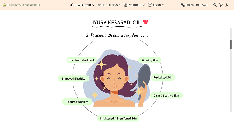
This design concept aims to create a luxurious and immersive landing page for iYURA Kesaradi Oil, an Ayurvedic beauty product.
Concept: Embrace Nature's Touch
This design goes beyond just visuals. It creates a sensory experience that evokes the natural world and the essence of your Ayurvedic product.
Here's how:
1) Soft Color Palette: Soft, Earthy tones inspired by the product's ingredients (rose pink, gold, saffron yellow, and brown) create a light, calming and luxurious atmosphere. Black accents ensure clear, easy-to-read text.
2) Typography : Delightful & Easy on the Eyes : The color palette is complemented by a calming font combination –
MV Boli for elegance and
Noto Sans for readability.
3)Visuals: High-resolution photos and illustrations that showcase the natural beauty of the ingredients and the radiant results the customer can achieve.
Why This Matters:
This design approach goes beyond aesthetics.
It helps with:
Priming: The natural visuals and colors subconsciously prime users for a product rooted in nature's bounty, building trust and anticipation.
Branding Identity: The color palette and visuals establish a strong brand identity that aligns with the Ayurvedic philosophy and commitment to natural ingredients.
This combination of design elements creates a cohesive and immersive experience that effectively positions the product within the natural wellness space.
What Neuromarketing Principles does this employ?
This captivating animation transcends a simple scroll; it harnesses the power of neuromarketing to trigger the "Old Brain" and drive results.
Let's delve into the neuromarketing principles at play, each carefully chosen to grab attention and communicate the product's benefits that I have learnt from Patrick Renvoise's Book:
Visual Storytelling:
Our brains process visuals faster and more effectively than text.
The animation leverages this by telling a story entirely through illustrations.
This approach captures attention and allows the message to resonate on a deeper level.
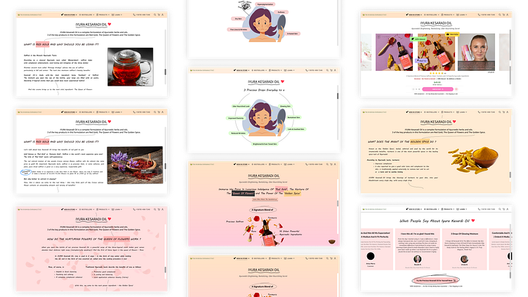
Contrast of Before and After:
The "Old Brain" thrives on simplicity and notices changes easily.
A stark contrast grabs attention and conveys the product's impact.
The animation showcases a dramatic "before and after" effect.
The clear difference emphasizes the product's transformative power.
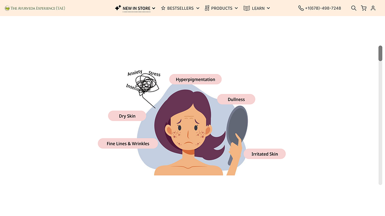
Tangible Words:
The "Old Brain" prefers clear, easy-to-understand information.
Tangible elements provide a connection to the product's benefits.
Three oil drops fall sequentially throughout the animation.
Each drop landing progresses the transformation, creating a cause-and-effect relationship.
This "dosage visualization" reinforces the product's simplicity and effectiveness.
Emotional Connection:
The Old Brain is swayed by emotions.
Positive emotions create a stronger connection and make a product more appealing.
Witnessing the transformation triggers a desire for beautiful, healthy skin.
It taps into our desire for self-improvement and confidence.
This emotional connection makes the product seem more appealing and relevant.
Self-Centered Appeal: The Power of "Me"
The Old Brain prioritizes survival and self-improvement.
It's most receptive to messages focused on the user's personal benefit.
The animation showcases a transformation to radiant beauty.
This taps into the user's desire for self-improvement and beautiful skin.
It makes the product seem directly relevant to their goals.
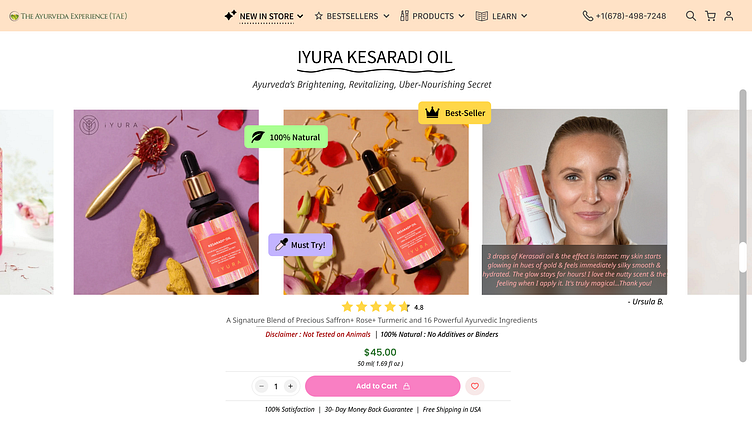
Building Trust & Desire on the Landing Page
The Power of Smiling Customers:
Strategic photo inclusion: A smiling customer holding the iYURA Kesaradi Oil reflects the product's benefits (radiance, happiness) – aligning with the illustration on page 2.
Positive customer testimonial: Builds trust and social proof for potential buyers.
Scientific Backing:
Studies by Nielsen Norman Group, Journal of Consumer Marketing, and University of Würzburg show images of real people smiling significantly increase trust, engagement, and attention.
Micro-Influencers for Credibility:
Product images tagged with key selling points ("100% Natural," "Must Try," "Best Seller") act as micro-influencers, subtly influencing user decision-making.
A Call to Action with a Touch of Luxury:
Pink call-to-action button evokes feelings of luxury, indulgence, and natural beauty through its color association with roses (a key ingredient).
Aligns perfectly with the overall brand image.
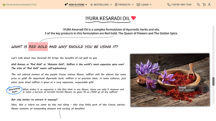
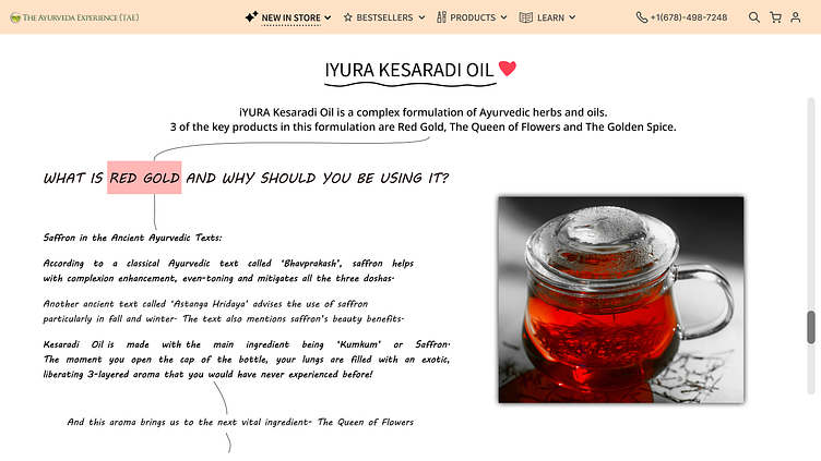
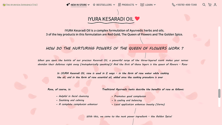
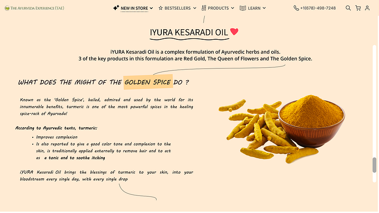
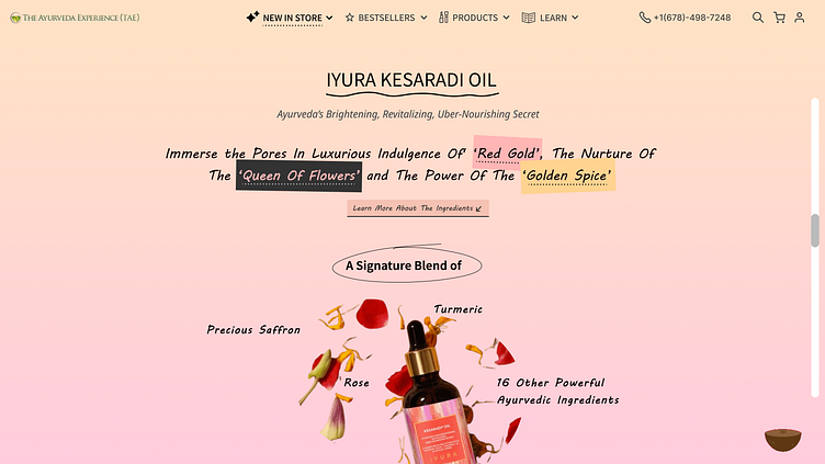
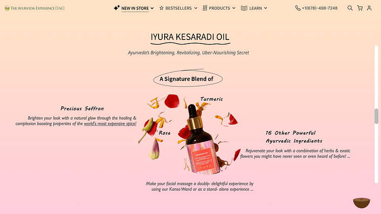
Seamless Scrolling and Ingredient Exploration: A Comic Book Journey
Unfolding the Story: Ingredient by Ingredient
These ingredient explanation pages are visually connected by a delicate, hand-drawn line that flows behind the text, reminiscent of panels in a comic book. This design choice serves multiple purposes:
Encourages Scrolling: The line subtly indicates there's more content below the fold, encouraging users to explore further and learn about each ingredient.
Combats False Floor Illusion: It prevents users from mistaking the current page for the end of the content (a "false floor"), which is an important pitfall to avoid in terms of UX.
Comic Book Storytelling: This design element evokes the feeling of a sequential narrative, similar to how comic books unfold their stories one panel at a time. Users are drawn in, wanting to see what unfolds on the "next page."
Immersive Visual Storytelling:
Each ingredient section boasts high-resolution photos that showcase its essence. The background complements these visuals with subtle color palettes reflecting the ingredient:
Rose: Light pink background with delightfully animated roses, creating a sense of natural beauty and indulgence through parallax scrolling.
Turmeric: A light tint of golden yellow evokes the warmth and brightening properties of turmeric, further enhanced by subtle parallax animation.
This combination of visual storytelling techniques creates an immersive and engaging experience for users as they discover the benefits of each ingredient, just like following a captivating comic book narrative.
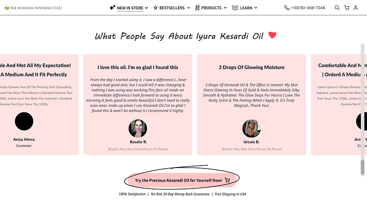
Testimonials with a Call to Action
The last page of the iYURA Kesaradi Oil landing page prioritizes social proof and conversion, featuring testimonials from satisfied customers. Here's a breakdown of the key elements:
Customer Testimonials:
The page prominently displays positive quotes from real customers about their experience with iYURA Kesaradi Oil.
Including names of the customers adds credibility and authenticity to the testimonials.
Call to Action (CTA):
A clear and prominent CTA button sits below the testimonials, urging visitors to take action. The button's color is pink just as it is in previous page and is designed to grab attention with a hand drawn line circled around the CTA and to encourage clicks.
Results May Vary Disclaimer:
A subtle disclaimer like "Results May Vary From Person to Person" is included to manage expectations and comply with advertising regulations.
Overall, this last page aims to leverage the power of social proof to build trust and confidence in potential customers. By showcasing positive experiences from real people, the design encourages visitors to take the next step and convert.
To collaborate contact me at :
shreyasjswork@gmail.com
I specialize in crafting compelling user experiences that drive conversions through the fusion of design ,psychology , neuromarketing and animations (Lottie) .