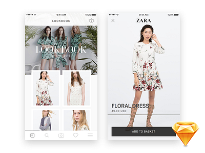
Zara Lookbook Gallery • Freebie
I like how the contrast between images and the white space kept the interface clean and minimal.
The first screen is a representation of a photo grid that partially floats on top of a carousel of other images. While the second one is a full view of the selected item with its brand, description, price and an option to add it to the basket.
I hope you guys like this concept.
Enjoy and play around with this simple design by downloading its Sketch file :)
Don't forget to hit L if you like this shot.
More by Jardson Almeida View profile
Like


