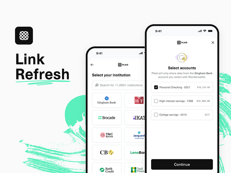
Link Refresh
At the end of last year we refreshed Plaid Link, our product that lets people securely connect their financial accounts to a customer’s app in seconds.
This update was focused on four themes:
Smoother transitions. Each step now seamlessly animates into the next with a graceful fallback for longer wait times.
Contextual loading. This gives more context into what is happening during the longest points of loading when connecting an account.
Increased density. We updated our type scale and component sizes to create an experience that better adapts to a wider range of devices.
Less visual noise. Simplified illustrations and components help you focus on the task at hand.
Link’s new components are designed to make patterns and interactions easier to deliver, enabling us to ship new features even more quickly.
Design Support: Ryan Smith, Ian Jaye, Isabelle Charafeddine
Research: Jordan Laughlin
