Canvas
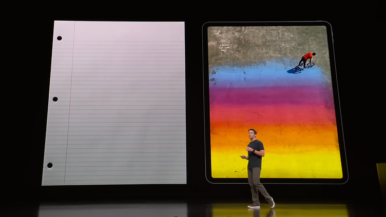
The 12.9" iPad Pro is about the same size as an 8.5" x 11" sheet of paper. With that—along with a desire to try to blend the physical with the digital—in mind, I wanted to design a simple iPad app that feels like you’re sitting at your desk and just writing on paper.
Now, obviously, drawing on glass is not the same as drawing on actual paper, but I don't mean it literally. Procreate, for example, feels like a drawing app, and, in a way, I'm trying to do the opposite of that. I don't want to have a UI that you can dig into for tools, layers, preferences, etc. I want to make something that doesn't feel like software. Something a little more substantial—like turning a page in the Apple Books app.
This is an app concept that I'm calling Canvas.
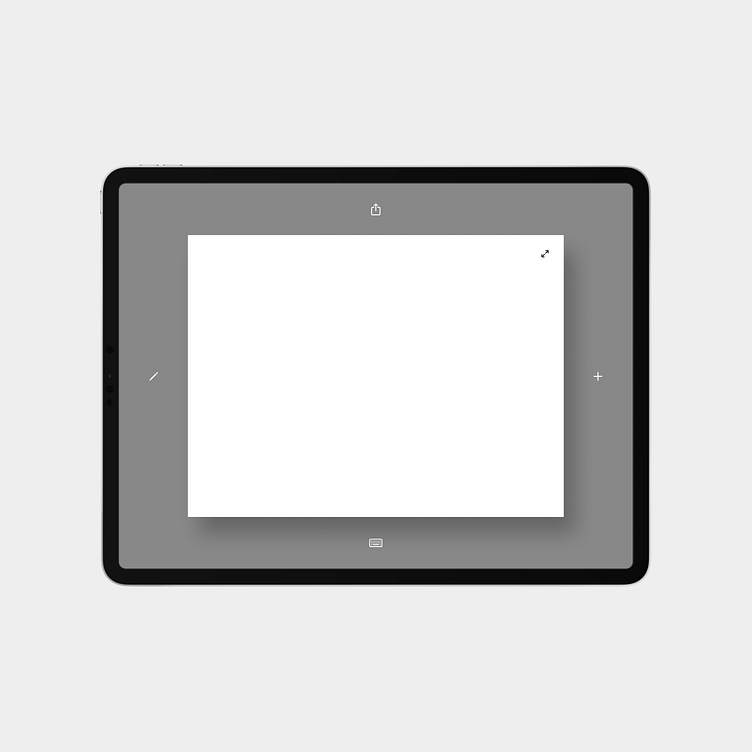
My initial idea for the interface is simple. A clean sheet of paper and five buttons.
You can draw, you can type, and you can share. That's pretty much it. You can expand the sheet for a more immersive, full-screen experience, you can add a new sheet if you run out of space, and it'll work in any orientation.
I wanted to incorporate some of the constraints of actual paper and marry them with the benefits of digital. For example, you can't zoom in/out, but you can undo/redo. This is not an infinite canvas. It's just a piece of paper for you to jot your thoughts and ideas down.
I've taken inspiration from the Paper app which was originally built by FiftyThree and is now run by WeTransfer.
I'm using Apple's SF Symbols for the button icons.
As mentioned, this is my initial idea. While part of me finds this minimalist interface intriguing, it's pretty obvious that I hadn't thought about everything just yet. I have since modified my design as time has passed and ideas have flowed, and I plan on continuing to share my mockups along with my thought process as this is an ongoing project.
First prototype
Here's a quick prototype of my initial idea for this app. Really simple.
Again, this is an ongoing project, so the current version of this concept no longer looks exactly like this, but I just want to share as much as I can and walk through a timeline of my ideas for this app experience.
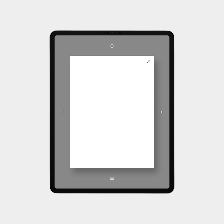
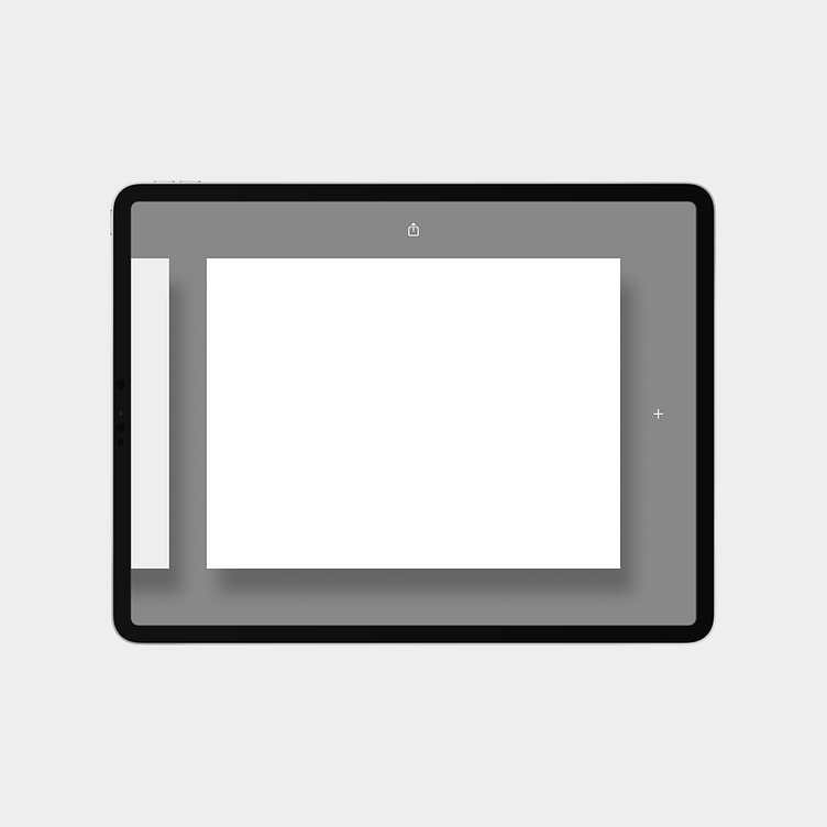
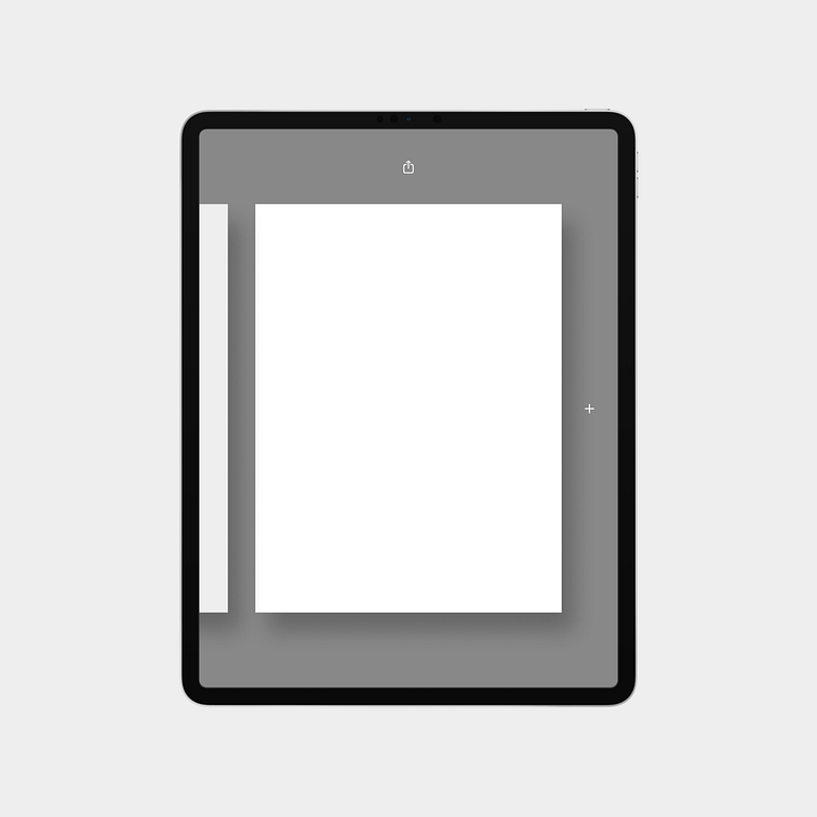
What if the user has an external keyboard?
I use a Magic Keyboard with my iPad when I want to write or just have the iPad propped up, so, for this prototype, I thought about what it should be like if/when using Canvas with an external keyboard.
Since the software keyboard won't slide up from the bottom, I highlighted the Keyboard button to indicate that you're in writing mode, and I figured the sheet should expand to feel more like you're writing on a vertical page like in Word or Pages.
I also moved the Keyboard button to the left side and coupled it with the Pencil button since those are the two primary input methods.
I just realized this may not have the same effect when in portrait mode because you'd already be seeing the full page, so I'm not sure how I feel about this, but it's an idea I wanted to animate.
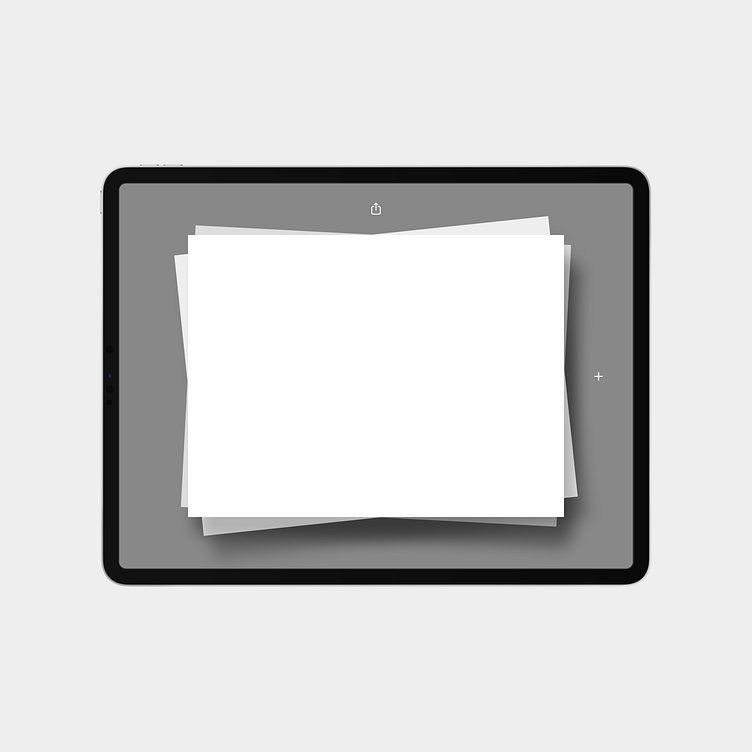
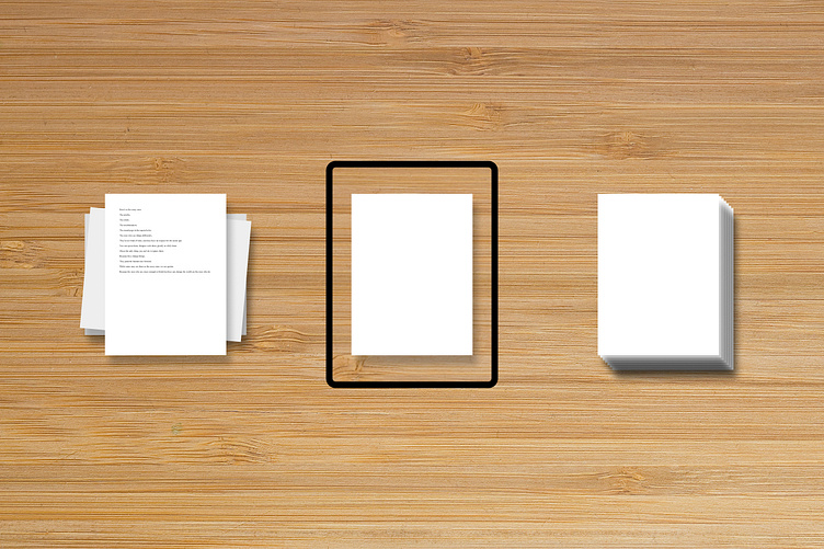
Adding a sheet
I've thought a lot about what adding a sheet should be like.
Imagine you're at your desk. You have a sheet of paper in front of you and are sketching an idea you have for a new car dashboard, for example. After a few minutes, you decide you want to start over, but you don't want to erase your work, so you grab a new sheet from a stack of paper to your right and start sketching again.
That's what I want this to feel like. The iPad is the canvas. The point of this app is for you to have a clean canvas for drawing or writing without any clutter and ornamentation distracting you from whatever it is that you want to get out of your head.
While I think this card-style UI makes for a cool prototype, I wonder what other ways I can do this...
Stack
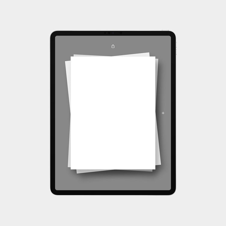
We could keep the sheets centered, stacked on top of one another, and rotated slightly to look and feel more like an asymmetrical stack of paper that one might actually find on a desk. This is visually appealing, but it could be tricky if too many sheets are stacked.
Carousel
Maybe they don't stack at all and the sheets move like a carousel. I think this might be the way to go.
I need to think about this a little more. If y'all have any suggestions, please send them my way!
The vision
This is my vision for the Canvas app. I want it to feel like this here.
Front and center: a clean sheet of paper for you to draw or write on with minimal distractions.
To the right: a stack of unused paper for you to grab when you need to.
To the left: sheets that you've drawn or written on that you can sort and search through later.
Reminder: the app is meant to be used in any orientation.
I'm still ideating on what the left side should be like. In the beginning, I didn't want to have an interface for your history. Somewhat reminiscent of Digital Touch on the Apple Watch, I wanted this app to be used for putting fleeting thoughts down and sharing them there and then. I've grown fond of the idea of live, in-the-moment digital experiences. I'm starting to think, however, that maybe it would be a good idea to be able to see your history of thoughts, ideas, and sketches. I just need to figure out what that should look and feel like.
History
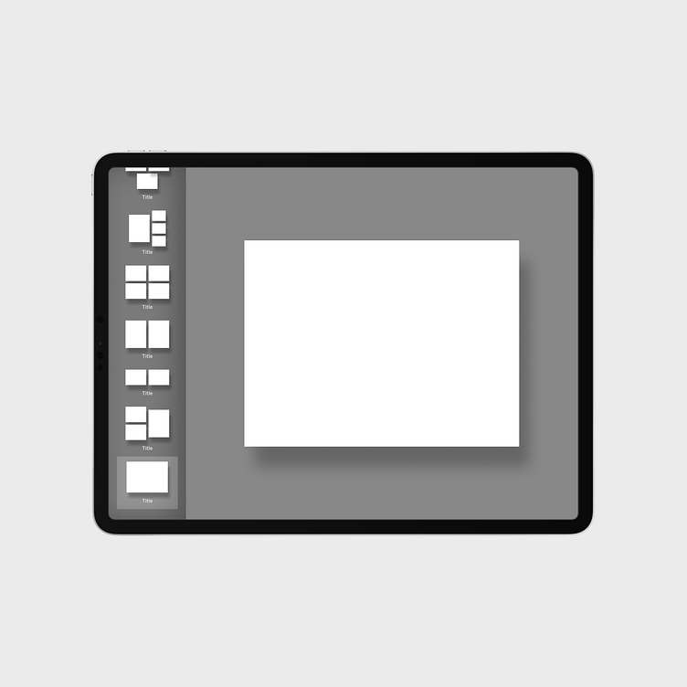
Gallery view

This is a late addition to the handful of ideas I had for the history experience. After some time sitting on my initial ideas, I decided to start from scratch and simplify, and this was the result of that. Super simple. No titles, no groups—just a gallery of sheets to swipe through from newest to oldest. Feels pretty natural on iPad.
Thumbnail view
I appreciate the simplicity of the thumbnail view. You can glance at just over a handful of groups of previous sheets and quickly swipe to scroll through them. Sheets would be grouped by date created. This wouldn't pull you away from the main screen, which is normally a good thing, but with the desktop metaphor in mind, I kind of want to be pulled away from the main screen and dive into the history of my sketches and writings.
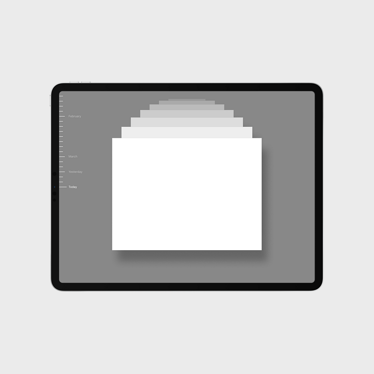
Calendar view
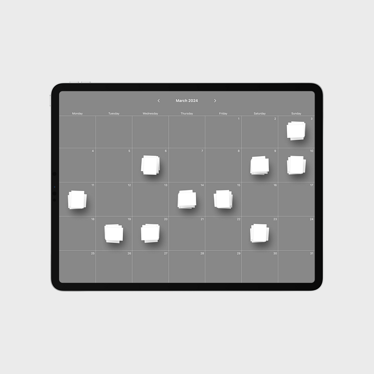
Calendar view was my least favorite idea at first, but it grew on me.
Circling back to the desktop metaphor and my vision for this app, I want it to seem like there's a camera above your desk, and what you're seeing on the iPad is what the camera is seeing. On the main screen, you see the single sheet of paper—no distractions. Tapping on the history button would make the camera pan over to the left side of your desk and give you a bird's eye view of a calendar where your previous works would be stacked and grouped by the date in which they were created.
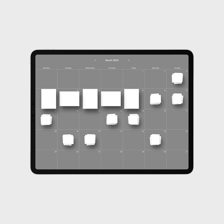
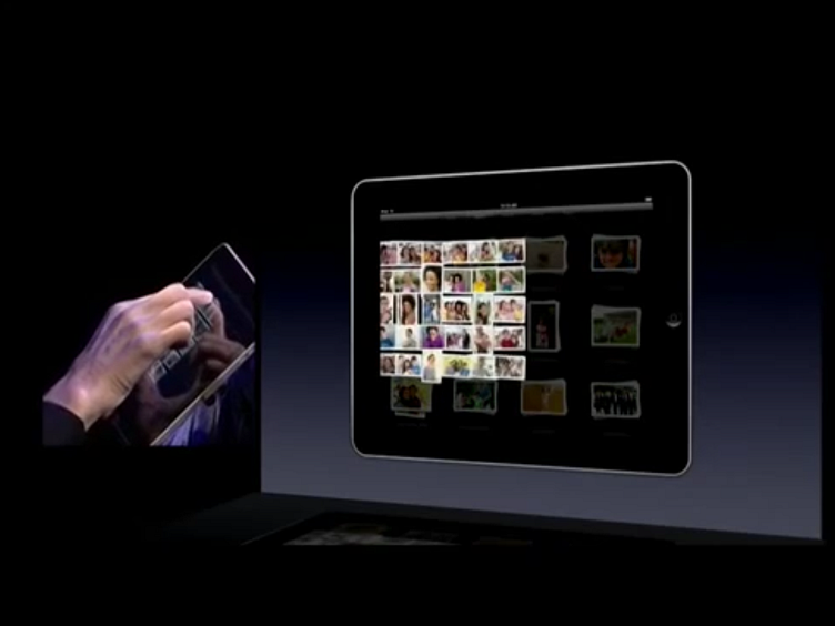
When I was drawing the Calendar view, I thought it would be neat if we could hover over the stacks, which are pretty small, with the Apple Pencil to get a peak at what's inside. Similar to the way we were able to pinch out on a stack of photos in the first version of the iPad Photos app to peak inside of the album (shown below).
Time Machine
This was just a fun idea. I got my first Mac after iCloud was introduced, so I've never actually used Time Machine, nor have I ever felt like I needed to. I do appreciate the user experience, though, and I thought it would be fun to try to make it work for this app.
Update
I've had some time to think about this concept, and there are two major decisions I've made.
Full screen only.
I initially thought it would be a good idea to be able to draw and write on the sheet whether or not it was expanded to fill the screen. I've decided, however, to make it so that we can only draw and/or write when in full screen because of the larger, more natural size of the canvas. I figured it might be easier to get into a flow state on something that actually resembles a sheet of paper, and then go back and have it sit within the frame of the main screen where you'd be able to share, add a new sheet, delete the current sheet, or see your history.
No typing.
When I decided to turn this idea into a prototype, I wanted to incorporate typing with a keyboard—whether it be the software keyboard or an external one—but I've decided that this isn't the app for that. There are other apps tailored for long-form writing, so I'm removing that feature from this app concept. The Pencil will be the only input method—along with your fingers, of course. This idea came after using my iPad without the Magic Keyboard for a few weeks. Some may say this is the way the iPad was always intended to be used, and, for the most part, I think I agree.
Now—just because I'm removing typing with a keyboard as an input method doesn't mean writing can no longer be done. I don't want to get into the details about the benefits of handwriting vs typing, but I do want to mention an iPadOS feature that I had completely forgotten about, and that is Scribble. With Scribble, you can turn your handwriting into typed text. Scribble is one of the tools that can be used from within Apple's own Pencil toolkit, which I utilize in this concept, so it's easily accessible and genuinely feels magical when you use it.
