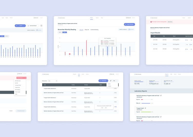
Palmatrack - Dashboard UI & UX
I was required to research, wireframe and design the entire product while working in an agile team. This included the user journeys, page designs and interaction examples for the developers and client.
Letting functionality drive this product's aesthetic was a no-brainer, it's easy to use for English and non-English-speaking users. The robust design system can swap languages without breaking any UI, is simple to use and looks good.
Very direct and intentional colours had to be used for specific use cases, such as red for level warnings that lab users needed to address.
More by Luke Cannon View profile
Like


