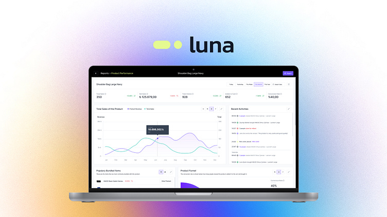
Product Performance Dashboard
The user journey in Luna dashboard is simple and offers a smooth user experience. Instant search, quick navigation and easy return options are available to allow users to quickly access the information or functions they want. By highlighting key metrics, it provides faster access to key information.
In the first solution, sellers display their products through a datatable. When they click on the icon button next to the products, the "Go to product performance report" tooltip appears and users are directed to that page.
In multi-functional structures/screens, it is necessary to convey a lot of information to users and to provide more information with fewer clicks. For this reason, the screen is divided into two, adhering to the 9 by 3 grid structure. Users can select the product they want from the list on the right and instantly review it on the dashboard on the left.
Metrics used in dashboard charts;
total number of sales of the product/product revenue,
total number of returned products/ratio of purchases,
how many people viewed at the product/added to the cart/bought it (with conversion rates),
total number of comments of the product and the last comment,
populary bundled items,
weekly visitors count,
customer map,
recent activities
.
.
.
.
.
#UIUX #Dashboard #DataVisualization #ProductPerformance #B2B


