playerfinder ✻ Branding
Hello 👋🏻
I'd like to share a brief branding overview of my project centered around connecting people for shared sports activities.

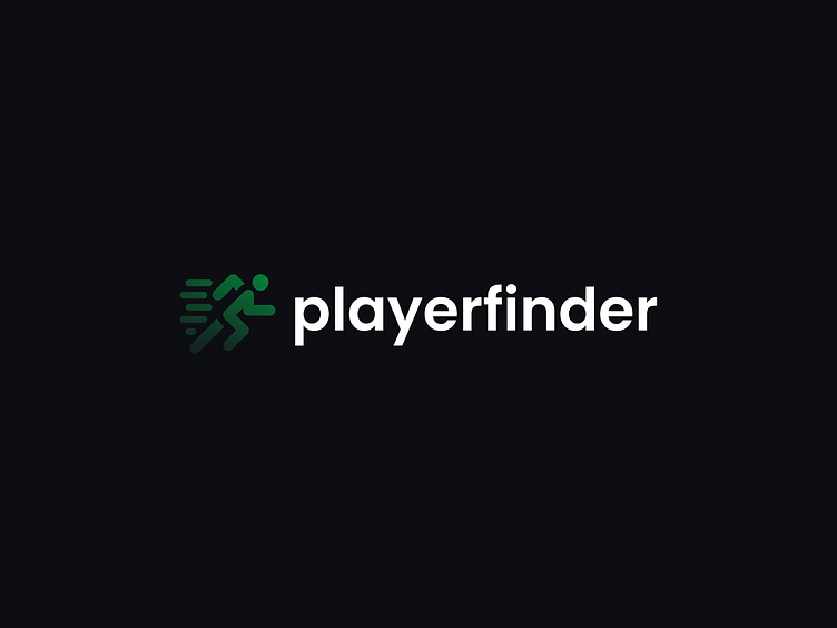
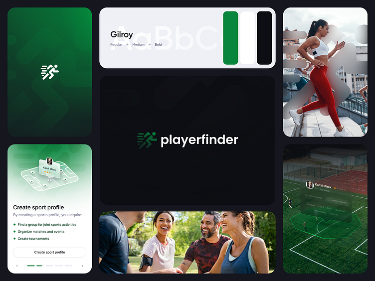
Using rounded shapes, we aim to showcase the flexibility our project is designed to offer. The green color scheme reflects a healthy lifestyle approach, while the dynamically running figure symbolizes the speed in finding suitable partners for engaging in sports activities together.

Thanks for taking a look!
If you liked the project, don't forget to leave a heart! ❤️
Don't forget to follow me on ⎯ Twitter ✻ LinkedIn
✻ Open for work
I would love to hear about your idea.
Feel free to contact me at ⎯ kvmilmitek@gmail.com
