Ticket Detail Screen | Ecolines Mobile App
Hello everyone! 👋
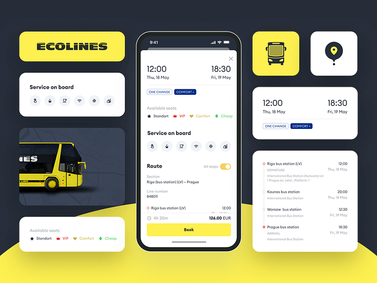
Today, we want to showcase the application development process of the Ecolines app further. In the shot, you can see the Internal Ticket Detail screen. It offers users a comprehensive view of their selected ticket, providing essential information and details for their journey. Users initially navigate to this screen after searching for tickets on the app's Search for Tickets interface📱😉
Upon selecting a specific ticket from the search results, users are seamlessly directed to the Internal Ticket Detail screen, where they encounter a structured layout designed for clarity and ease of use. The screen prominently showcases crucial details relevant to the chosen ticket, ensuring users have all the information readily accessible.
In general, we wanted to make it simple for users to access and manage important information related to the selected ticket, ensuring a smooth and informed booking experience in the Ecolines app 🤩
