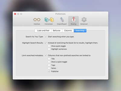
Daily UI #007 - Settings
I skipped a day yesterday so today I'm publishing two days of #dailyui. I meant to take half an hour on this one but ended up taking 1.5 hours. That's because I designed every element from scratch (although I did import the basic shape of the icons).
Calibre for Mac is a really great app in what it does (manage and convert ebooks of all formats), but the interface is ATROCIOUS. I'd love to redesign it, but from the forums I can see there's a huge resistance to simplifying the app because it has so many customizable features.
I took on one of my pet peeves: the "kitchen sink" preferences screen on the app, which is basically unusable unless you like to read a lot of instructions. However, since I did no wireframing or deeper thinking of the app, this ended up looking like a rather default OS X settings screen, which I think is fine.
Hopefully a future Daily UI assignment will allow me to revisit my Calibre mock-up and move the art direction further. :)

