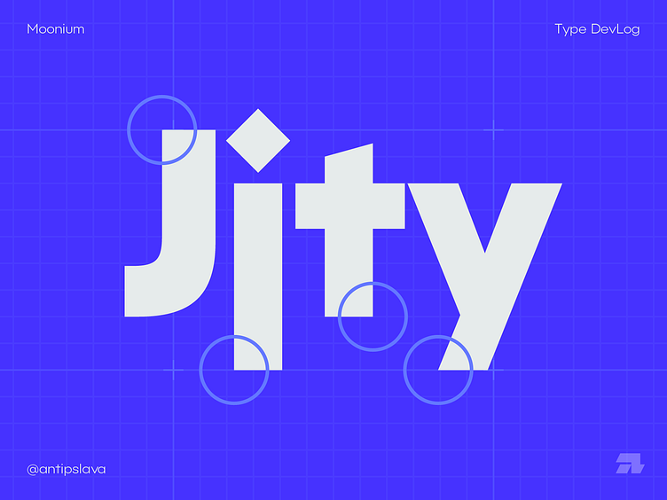
Moonium font development
Continuing to develop a new grotesque — Moonium. The main principles of the headset are simplicity, minimalism and modern forms of symbols. This effect is achieved by, for example, the absence of traditional curves in the letters "j", "t" and "y", but without them the font does not lose readability.
Portfolio and other social networks:
Behance | Instagram | Vkontakte
My email: antipslava.design@gmail.com
More by Slava Antipov View profile
Like
