Fitness App Home Screen
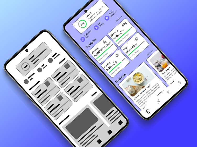
For me Mid-fidelity wireframes are more detailed than low-fidelity sketches, but still flexible. This lets you get valuable feedback on usability and layout early on, before you invest time in visual details. By keeping things simple, mid-fidelity wireframes help ensure your design works well before you worry about how pretty it looks.
These mid-level mockups are great for communicating your ideas to clients and stakeholders. They provide a clear picture of the structure and flow without getting bogged down in aesthetics.
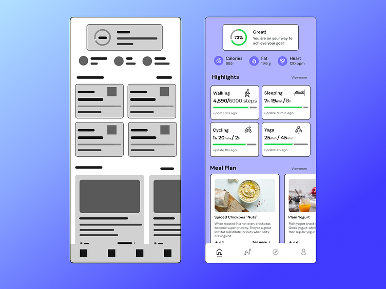
In High Fidelity design at the top of the screen, there is a motivational message with a progress bar indicating how close the user is to achieving their goal. There are three progress bars that track the user's calorie expenditure, fat burn, and heart rate.
Below the progress bars are sections that highlight the user’s activity in specific areas. In the designee each section displays the amount of time spent on the activity compared to a recommended amount.
The bottom section of the app displays a sample meal plan with a short description of each meal. Excited to share my latest project on Dribble! Any thoughts for improvement are welcome.