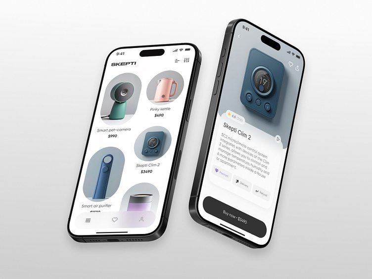
E-commerce App UI
Less is More:
A Modern Minimalist E-commerce App UI
Tired of cluttered online stores? I am too. Introducing my vision for a modern
e-commerce app that prioritizes simplicity and user-friendliness.
Focus on Products:
Clean layout: Generous white space and clear typography ensure products are the star of the show.
Effortless Navigation:
Intuitive bottom navigation bar: Provides quick access to key sections with minimal visual clutter.
Seamless product pages: View detailed information, high-resolution zoom, and product video demonstrations, as well as other customers' reviews with ease.
This minimalist design empowers users to browse, discover, and purchase with confidence, creating a truly enjoyable shopping experience.
Leave a comment if you like this design🖤
#ecommerce #app #ui #minimalism #userexperience #design #mobileapp
