Smart Home Landing Page with Dark and Light Duotone Effect
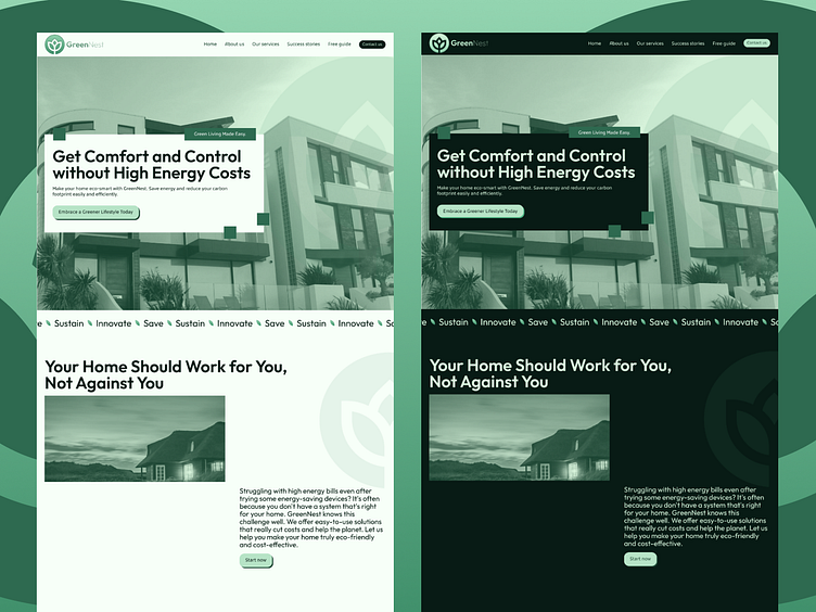
Presenting the GreenNest web concept, a landing page for an eco-friendly smart home platform.
This design embraces a duotone theme, switching between dark and light modes to enhance user experience. The color palette sets a mood that's both professional and edgy. Typography plays with Outfit for headers and Kufam for body, creating a clean, modern hierarchy. The brand's identity is woven throughout, with the logo recurring to anchor the storytelling narrative of the brand.
Which mode do you prefer—dark or light?
More by Kevin View profile
Like


