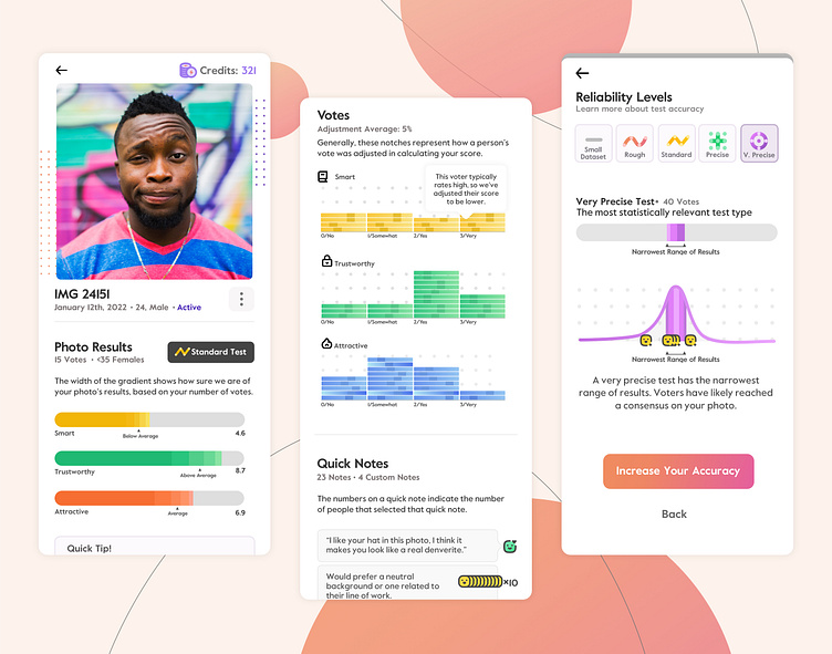
Photofeeler App Photo Results
UI & UX deep dive for an app for Photofeeler.com. One of the biggest challenges for Photofeeler, and especially their new app, was figuring out how to present complicated, boring, statistical data in a way that was not only compelling to look at, but also was really statistically informative, even for people who know nothing about statistics. The value prop is tied up in statistical accuracy - that is, the more people who review your photo, the more Photofeeler charges, aka they are charging for statistically relevant results. Explaining the nuances of statistical relevance to a user was extremely challenging. Read more on a future blog post I'll be posting.
More by Alexander Mark View profile
Like
