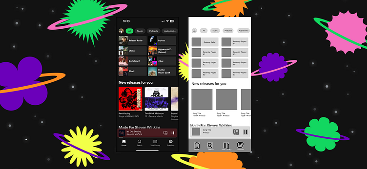
Create a low-fidelity wireframe
For this project, I wanted to learn how to create low-fidelity wireframes quickly. Drawing inspiration from Aliena Cai's YouTube video, "Figma UX tutorial for beginners - Wireframe," I dove right in.
Selecting Spotify's mobile app for my wireframe was a natural choice due to my personal affinity for the application, its adherence to contemporary UX/UI standards, and the company's notable success.
While navigating the project, I encountered a hurdle with the pen tool, which I was using for the first time. However, recognizing the project's objective of generating low-fidelity wireframes efficiently, I concluded that refining the icons beyond basic sketches fell outside the project's scope.
Coming soon: High-fidelity wireframing and more!
More by Steven Watkins View profile
Like
