In-App Banners
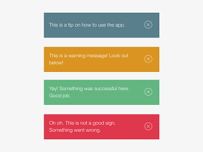
I've been spending a lot of my spare time lately trying to define, refine and consistently use the Hopper color palette. Our banner messages in the iOS app were completely inconsistent with color usage elsewhere and the actual colors themselves didn't really have the playfulness we attribute to our brand.
I recently update them with the above, taking their hue from the colors we used to update the When to Fly calendar when searching for a flight. We think the result is much more light-hearted, and much more on-brand.