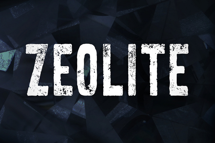
Zeolite
Beautiful disintegration. The idea for Zeolite came from old signs whose paint began to peel. We wanted to capture that state of weird equilibrium where everything is still very readable but nothing is intact. If you are going for that worn and weathered look then look no further. Great for a wide variety of uses from logotype, headlines, brand identity, apparel, poster, music, movie, games, magazines, books, comics, cartoons, YouTube, Instagram, to websites, or any of your creative design projects.
Zeolite is an all-uppercase font but the lowercase letters are textured in a different way. This essentially gives you two versions of each letter so you can choose which you prefer ot, better yet, vary them so letters in close proximity do not look like repeated patterns. Check out the product pictures for this effect. Have fun.


