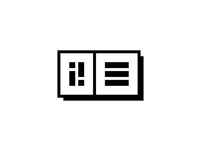
iNKMYDAY! logo (revisited)
iNKMYDAY! was my collaborative approach to a Design Bureau. It's closed since 2013, because I joined forces with another awesome Studio, but I like working on its identity nonetheless.
the thought process behind the logo:
First part of the Logo is the shortest possible acronym for the Name, taking the first an the last letter.
Second part on the right is a simple addition sign providing a build in possibility to chain the Logo in front of another logo, a title or something similar.
It's strictly geometrical, which is why it can be turned around if I want to put the logo after another logo (and therefore use the addition sign in front of the acronym).
Furthermore, the second part is replaceable, giving the logo flexibility to adapt to different contexts.
It could be replaced with an menu icon (as seen in the previous shots of the logo), another icon (as seen on the landing page http://inkmyday.com/), a numbering for limited prints or much more.
All in all the Logo represents my design ethos very well, which is heavily influenced by Dieter Rams design principles (https://www.vitsoe.com/gb/about/good-design).
What do you think?

