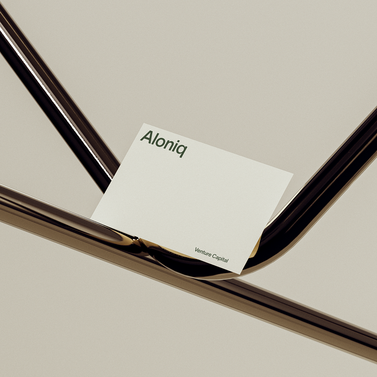
Aloniq: Brand identity
Crafting an identity for Aloniq wasn't just about aesthetics; it was about channeling their mission into a brand that speaks to its partners and industry. Leveraging a minimalist approach, the logo uses TWK Lausanne—a typeface embodying an ultra-organic aesthetic—to deliver Aloniq's message of 'competent friendliness.' No icons. No frills. Just a unique name with a strong character, designed to make a lasting impression.
Colors and fonts are more than just design choices; they're the silent ambassadors of your brand. For Aloniq, we meticulously selected a palette that complements their venture capital prowess. Paired with the TWK Lausanne typeface, the result is a holistic experience—synergizing Aloniq's distinct brand identity with its core values.
For more works visit our website.
Use this email to contact us mail@accuraten.com


