Approach & Approach Mono
Approach font family
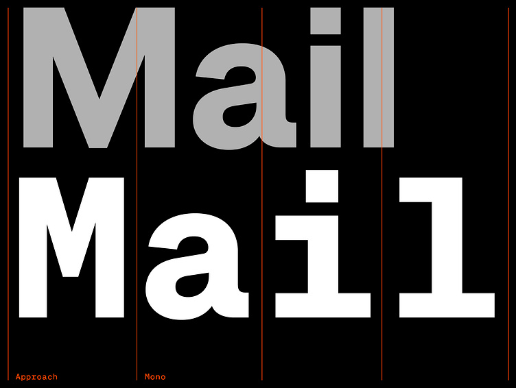
It is a modern approximation to the early grotesques. A utilitarian low contrast font, a bit mechanic but plenty of character. One of its characteristic elements is a kind of ‘elbow pipe’ shape that is present in many letters like the tail of the a, f, j, t, R, Q or 1 among others. Besides, the synthetic punctuation and quotes give it a more contemporary appearance. Approach tries to feel fresh against all odds, being familiar but different.
🔗 https://emtype.net/fonts/approach
Approach Mono family
It is the fixed width version of Approach. A utilitarian low contrast font, a bit mechanical but plenty of character. This version shares its main features with the original one, but it has a more prominent and visible punctuation. The more obvious use of a mono would be in tables, programming code or “in progress texts”, but not just that. Approach Mono can be used in the modern communication, bringing an aseptic voice to brochures, advertising, identities and any other piece of communication.